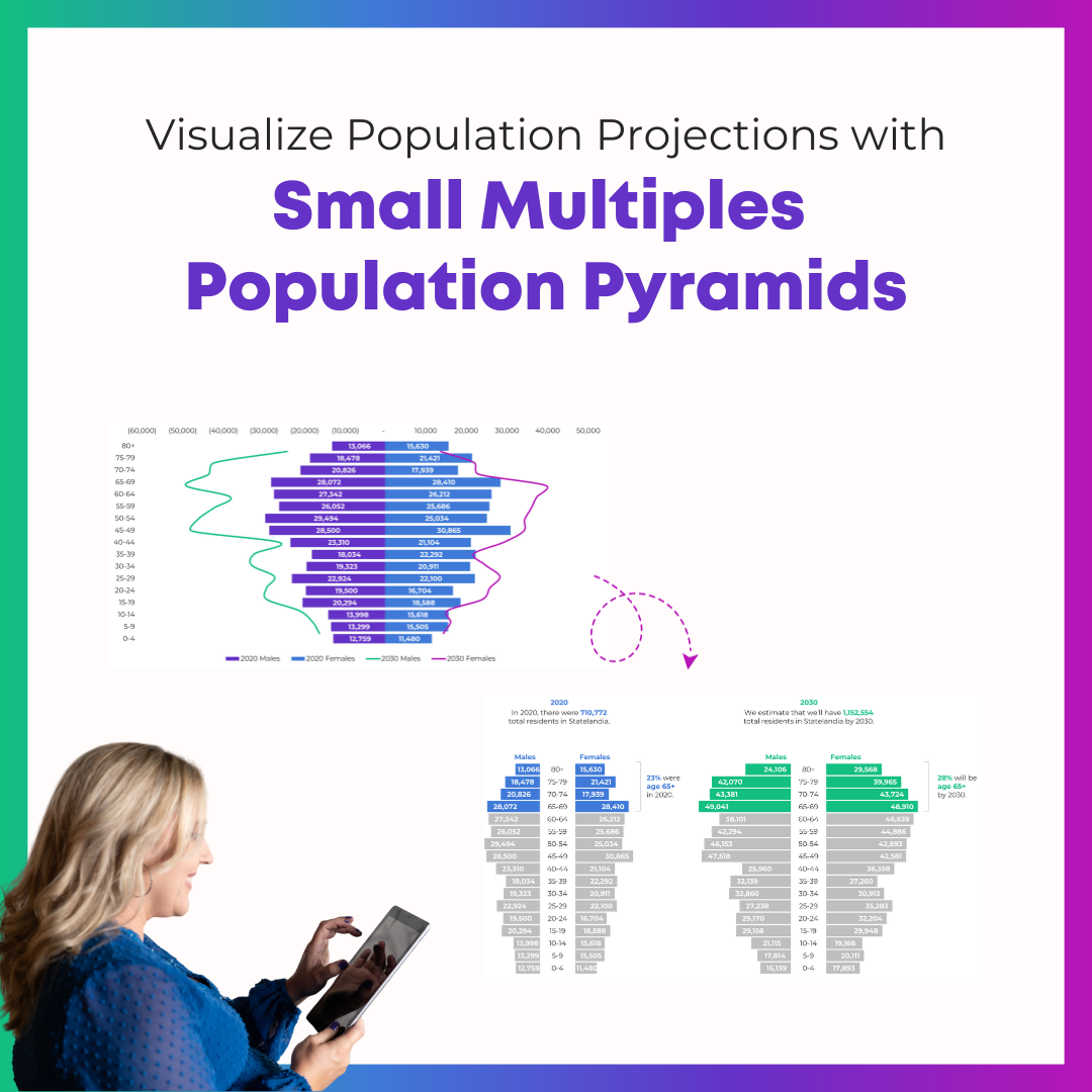
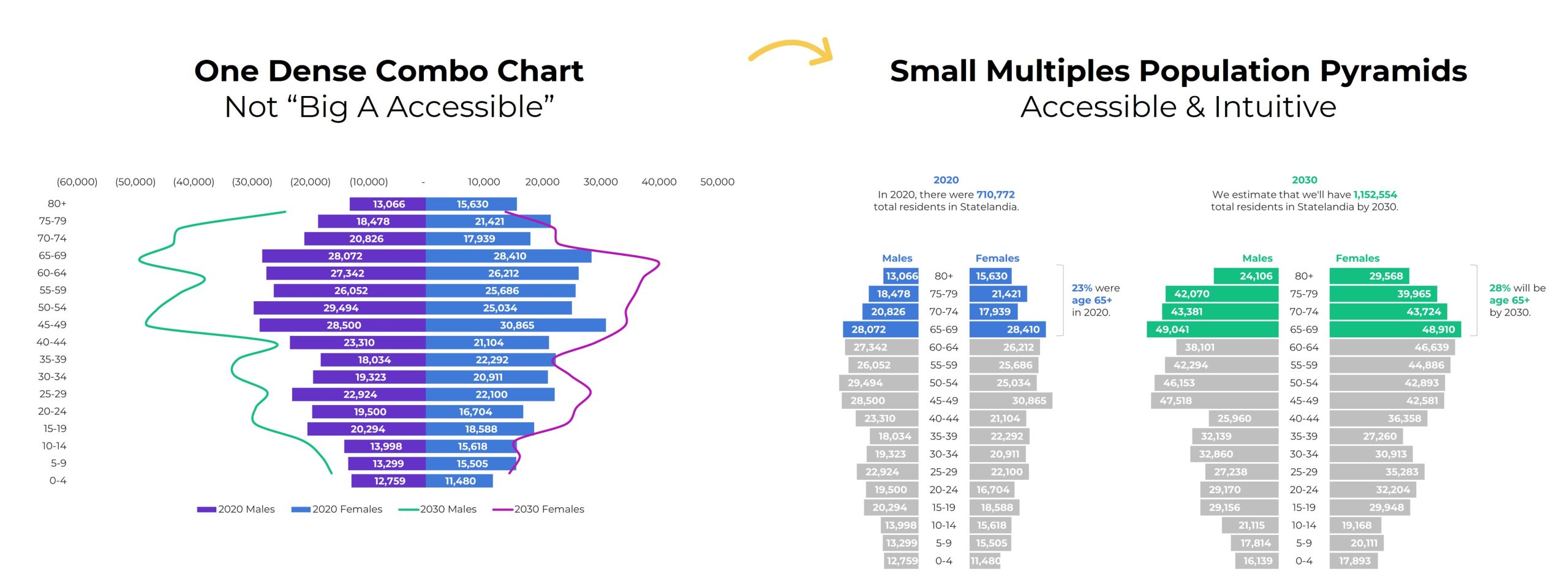
A few months ago, one of my favorite students brought this graph to Office Hours:
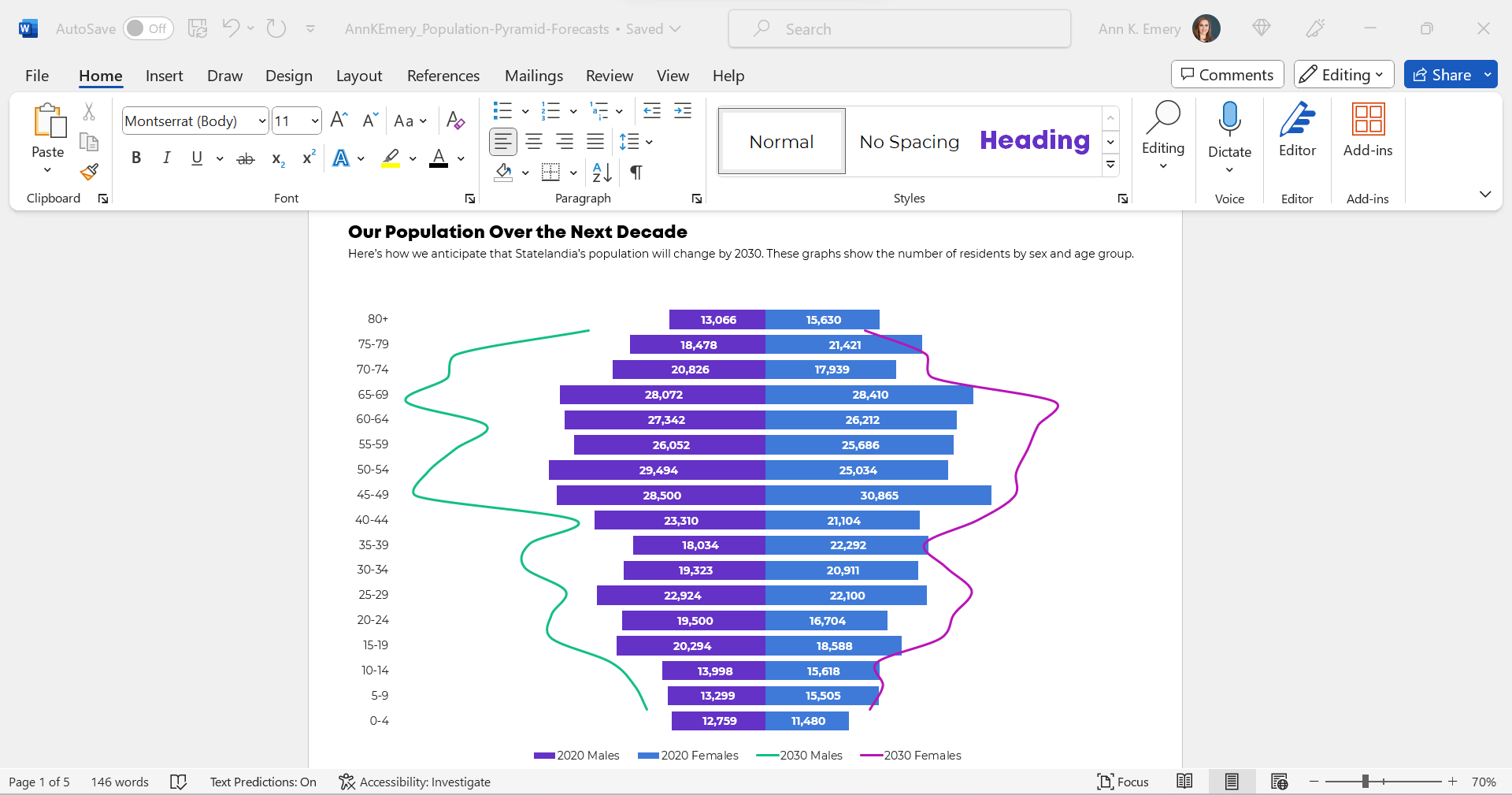
(These aren’t the exact numbers, age ranges, or years. But you get the idea.)
She already knew how to make population pyramids in Excel. Population pyramids require Level 4 vizardy skills. Woohoo!
But she wanted to take the population pyramid a step further, and she wanted to show how the population might change over time, especially for older adults.
So, she followed this online tutorial to add those curvy lines. (Yep, it’s made with a combo chart in Excel.)
Bare-Minimum Edits
As usual, we tackled the bare-minimum edits first:
- We removed the legend and directly labeled the data, which helps the graph pass “Big A Accessibility” rules (a.k.a. 508/ADA compliance).
- We nudged the bars closer together by reducing the gap width to make more of a smoothed-out histogram.
- We outlined the touching filled-in rectangles in white, a small detail that helps with grayscale printing.
- We used fewer colors. Before, there were 4 different hues: for 2020 males, 2030 males, 2020 females, and 2030 females. That’s a lot to keep track of! Instead, we color-coded by category (one hue for males, and another hue for females).
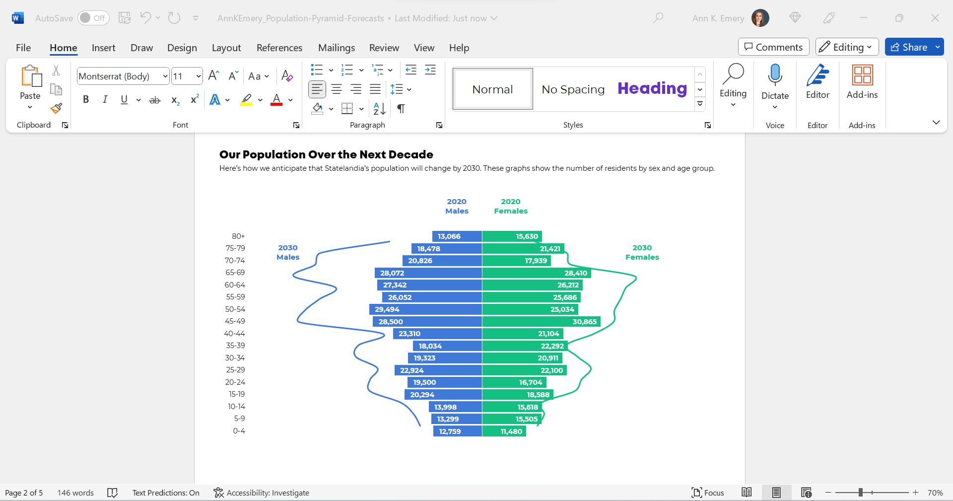
We also tried color-coding by year, instead of color-coding by sex, like this:
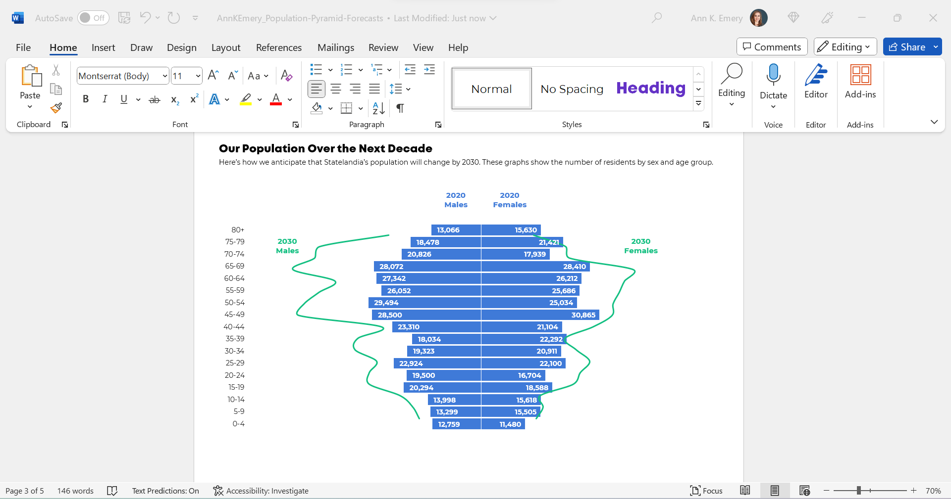
We were getting closer!
But we wanted to make sure that the forecasted numbers for 2030 were extremely obvious to viewers. For most of us, this isn’t a chart type that we see every day.
I was hesitant to keep the combo chart. This was an apples-to-apples comparison, so I wanted to use all bars.
(The bars/lines combo seemed more like an apples-to-oranges comparison, which this isn’t.)
Small Multiples Population Pyramids
Here’s a Dataviz Rule of Thumb:
Anytime your graph feels too dense… try creating more graphs.
Small multiples layouts can save the day!
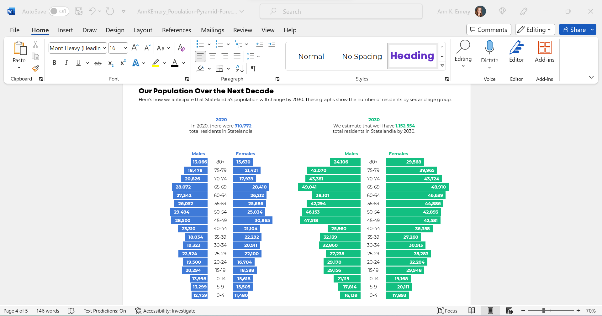
The Traditional Version
We tried traditional and storytelling versions of a small multiples population pyramid.
Here’s what the traditional version would look like inside her report.
You’ll notice the topical titles, color-coding by category (one hue per year), and how the graphs are all one color.
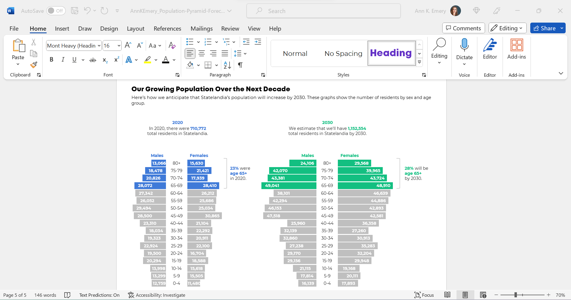
The Storytelling Version
And here’s what the storytelling version would look like inside her report.
This version draws attention to the 65+ age group, which she wanted.
You’ll notice the takeaway title, the color-coding by category (one hue per year), the dark-light contrast (highlighting the residents who are ages 65+), and the annotations.
The Bottom Line
Even with the bare-minimum edits, I wasn’t a fan of the original combo chart. The bar-line combo was suggesting an apples-to-oranges comparison.
Instead, anytime your chart feels too dense (when there are literally lines and bars combined within one chart), try a small multiples layout instead!
We can format the chart as a traditional or storytelling version. In this case, storytelling was a perfect fit because we especially wanted to highlight the 65+ age group.
3 Comments
For change between years with a population pyramid, I have used an overlapping bar chart format (grayed out bars for the previous year with the current year in a color) and annotations on where the greatest change occurred. Wondering if you would also find that an acceptable and understandable format?
That sounds promising! I wonder if it would get too busy (?). That could be a lot of different bars to compare.
Ann, you do such a great job of walking through the mental process and the related steps. Thanks for sharing this!