Remove how-to-visualize-population-projections-with-small-multiples-population-pyramids
article thumbnail

How to Make Great Graphs in Excel: 4 Levels of Excel Vizardry

Depict Data Studio

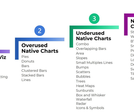
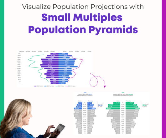
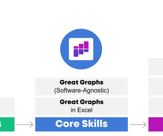
4 Levels of Excel Vizardry I’ve taught data visualization in Excel a dozen different ways over the years. I can’t get into the nitty-gritty details hacking Excel to make population pyramids… if someone’s never heard of a population pyramid before. We start easy. Easy to make!

article thumbnail

How to Visualize Population Projections with Small Multiples Population Pyramids

Depict Data Studio

She already knew how to make population pyramids in Excel. Population pyramids require Level 4 vizardy skills. But she wanted to take the population pyramid a step further, and she wanted to show how the population might change over time , especially for older adults.

Insiders

Sign Up for our Newsletter

This site is protected by reCAPTCHA and the Google Privacy Policy and Terms of Service apply.

Trending Sources

article thumbnail

10 Must-Have Analytical Skills

Depict Data Studio

For most projects, it goes something like this: Planning. You might participate in a program evaluation where the evaluator helps you brainstorm what your questions are and how to collect data to answer those questions. Visualize the data and share the reports, one-pagers, dashboards, and slideshows with stakeholders.

article thumbnail

Learn How to Make Great Graphs in Excel with Ann K. Emery

Depict Data Studio

With intentional editing, you can design visualizations that inform and inspire–right inside of Excel, PowerPoint, and Word. We added Office Hours so you can pick my brain about your individual projects. Great Graphs: Excel How To’s is open for registration this week only. This is a software how-to course.

article thumbnail

My 6 Data Communications Classes

Depict Data Studio

Two classes focus on core data visualization skills (translating technical information for non-technical audiences; making sure we don’t just have bar charts; and using colors and fonts that are branded, accessible, and intuitive). All of these classes fall under the broad data communications umbrella. Not sure where to start?