Let the data run free! Government organizations, academic institutions, non-profits, and even passionate sports fans are gathering and sharing valuable data sets with the public. The topics are wide ranging, from climate change to health to inequality to happiness. It is a powerful way to support a cause and encourage data-driven analysis.
These open data sets are set loose on a website in hopes that interested visitors will come flocking. How do you make that site as effective as possible? Simply posting the data in a searchable format isn’t enough. To achieve impact, you need to make it easy to understand, manipulate, and explore.
The following checklist is a collection of best practices and reminders for your open data project.
1. State Your Purpose
To start, you need to address the question: WHY this data? And WHAT can a viewer gain from using the data? The following examples feature prominent statements about the purpose.

https://www.oecdbetterlifeindex.org/

https://blackwealthdata.org/
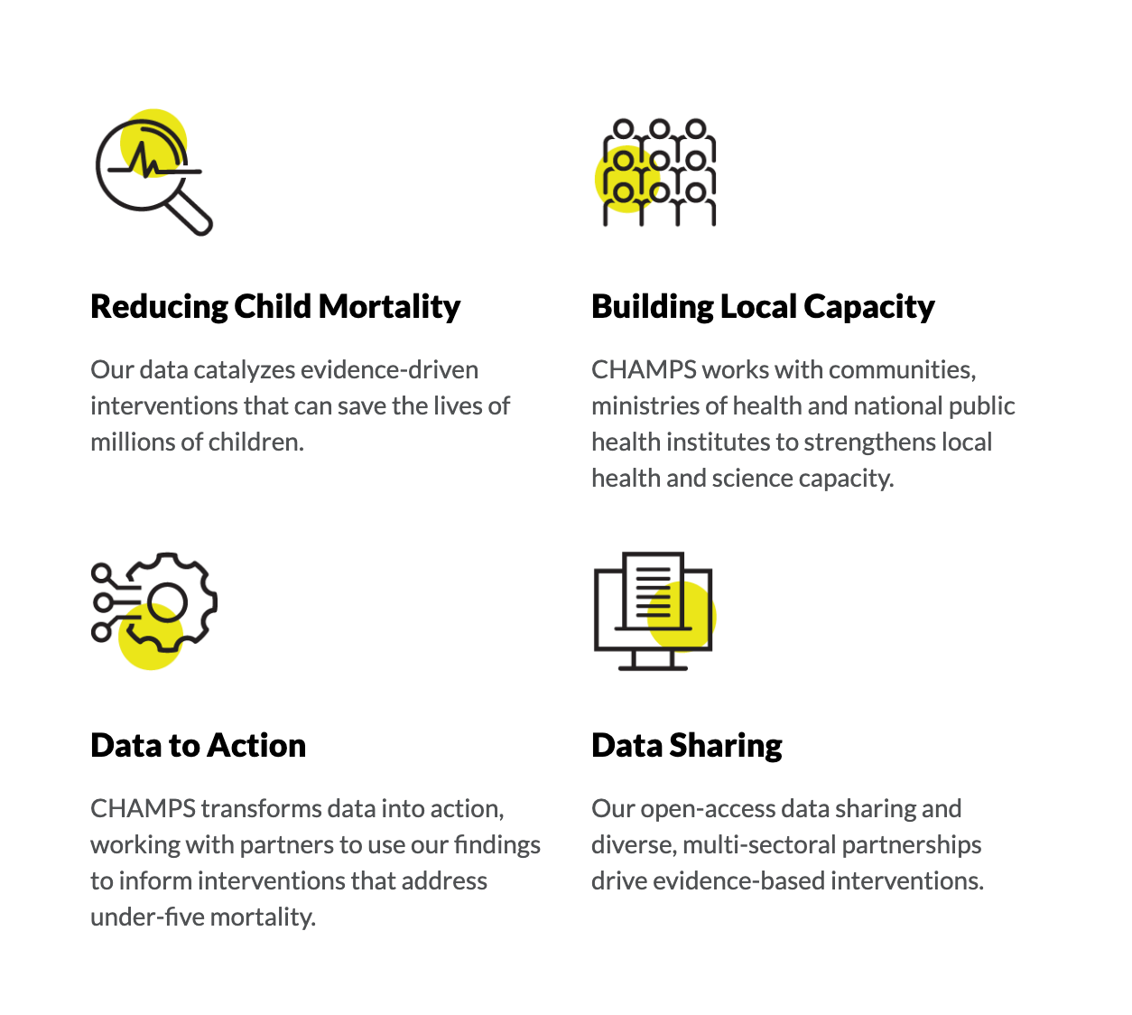
https://champshealth.org/
2. Segment by Audience or Topic
There are always many ways that someone could analyze and explore your data. Do them the favor of explaining HOW the data can be used. The best sites provide separate sections based on different users of the data and/or topic areas.

https://www.earthdata.nasa.gov/

https://dataunodc.un.org/

https://blackwealthdata.org/
3. Provide example insights
Naturally, you would like your visitors to find their own insights. However, they will benefit with a gentle nudge toward the types of insights that are available in your data. In the following examples, a few key insights are featured as a teaser to dive deeper into the data.
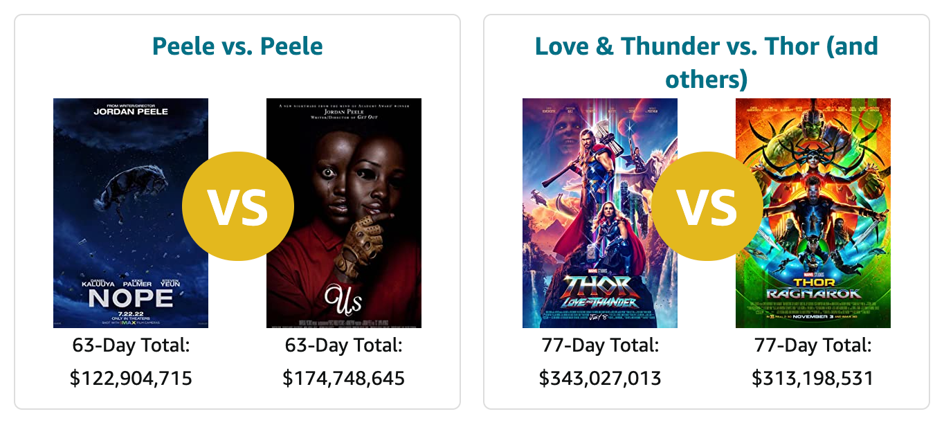
https://www.boxofficemojo.com/
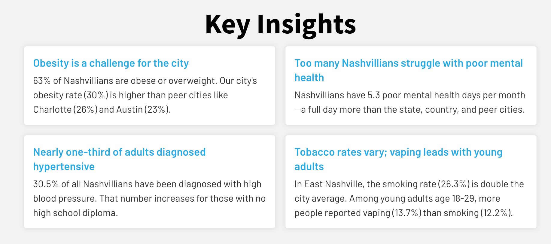
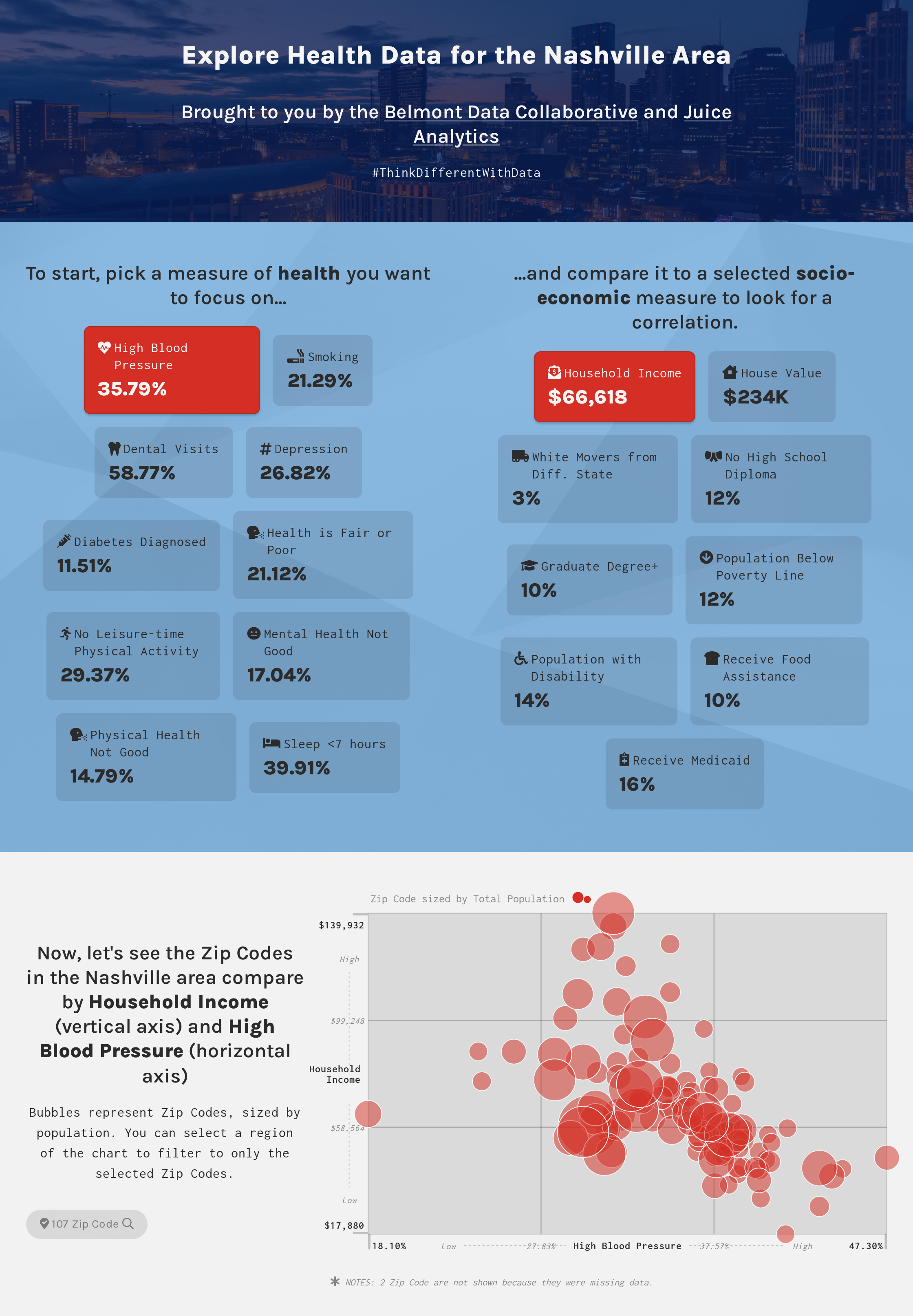
https://www.nashvillehealth.org/survey/data/

https://blackwealthdata.org/
4. Let users find their own data story
Too many open data sites simply provide downloadable access to the data. This is a missed opportunity, particularly for visitors who may not have advanced analytical skills. Interactive, exploratory visualizations give your visitors a playground to find their own insights in the data. This is where the leading data storytelling platform can lend a helping hand.
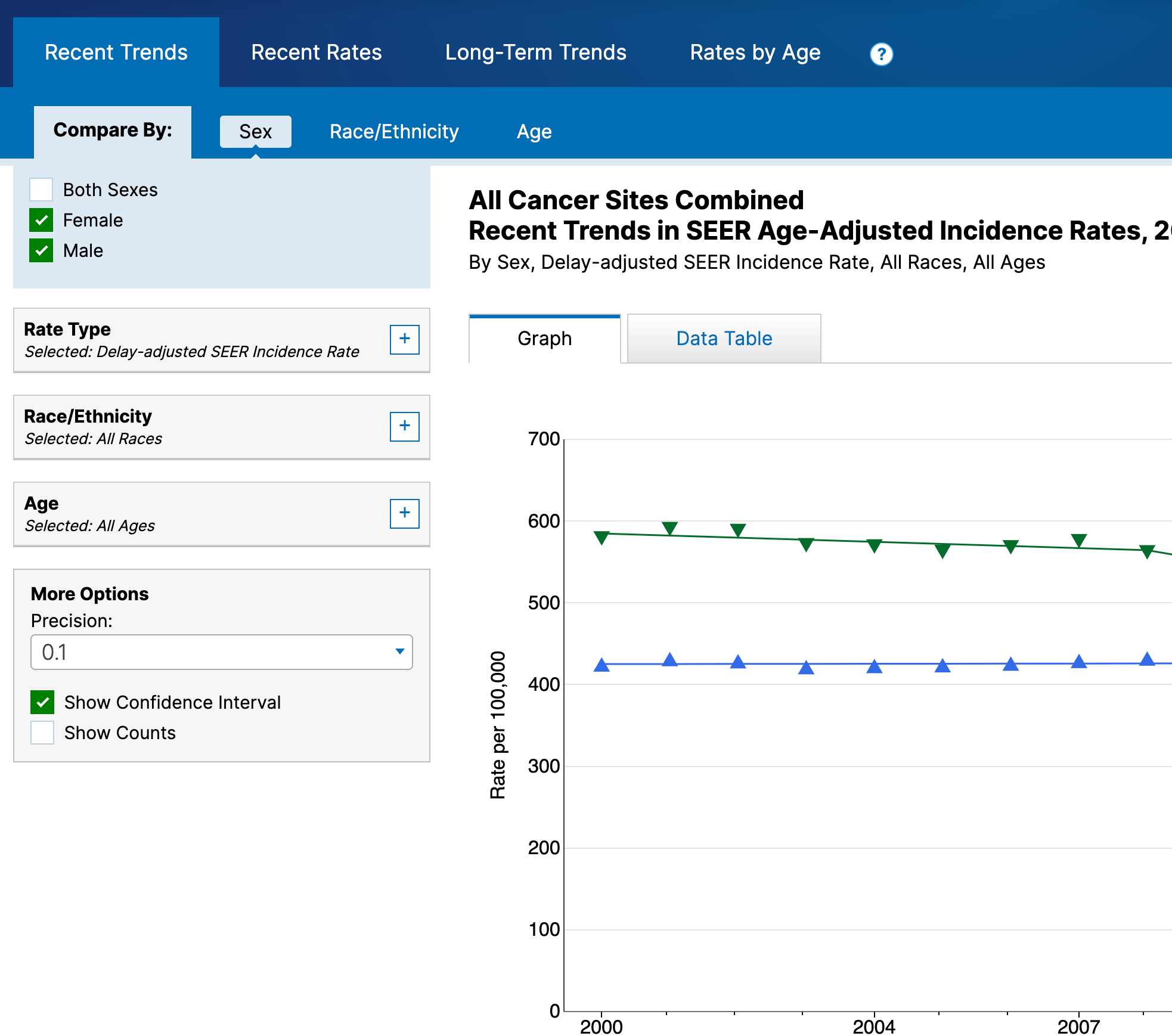
https://seer.cancer.gov/statistics-network/explorer/application.html
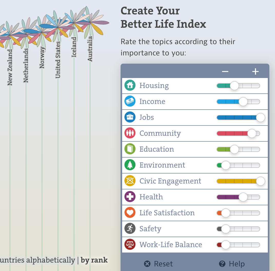
https://www.oecdbetterlifeindex.org/

https://www.nashvillehealth.org/survey/data/
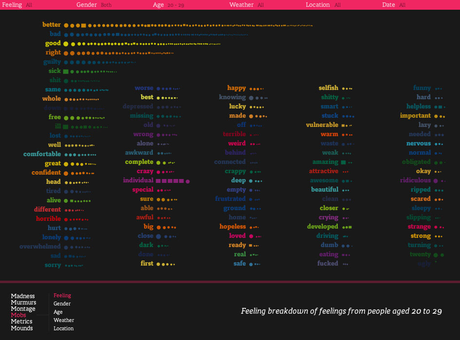
5. Encourage sharing of insights
If your site enables your visitors to find insights in the data, the natural next step is to let them share what they have found. Ideally, you’ll want the ability to capture specific visuals and share via social media.
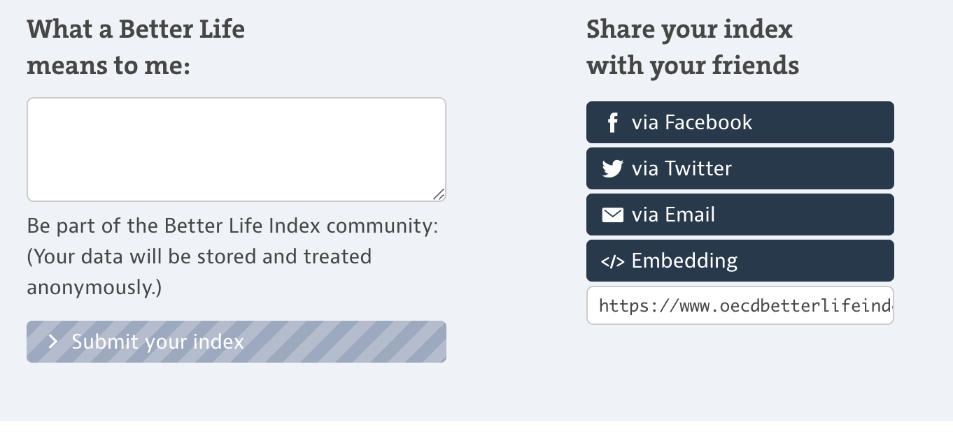
https://www.oecdbetterlifeindex.org/
https://news.crunchbase.com/web3-startups-investors/
6. Use simple, intuitive visualizations
Keep in mind that the visitors to your data site are just coming up to speed on your data. Complex visualizations and sophisticated analysis tools are likely to overwhelm them, and cause them to bounce. You want to lower the cognitive load by finding simple and familiar ways to present the data.

https://www.nashvillehealth.org/survey/data/

https://www.movebank.org/cms/movebank-main

https://www.oecdbetterlifeindex.org
7. Include real-life examples
By its nature, data is an abstraction from reality. It summarizes and aggregates many individual data points to find trends and insights. However, this abstraction can separate your visitors from the specific things that are represented in the data. Take a moment on your site to reconnect your visitors with the actual subjects of the data.

https://data.unicef.org/
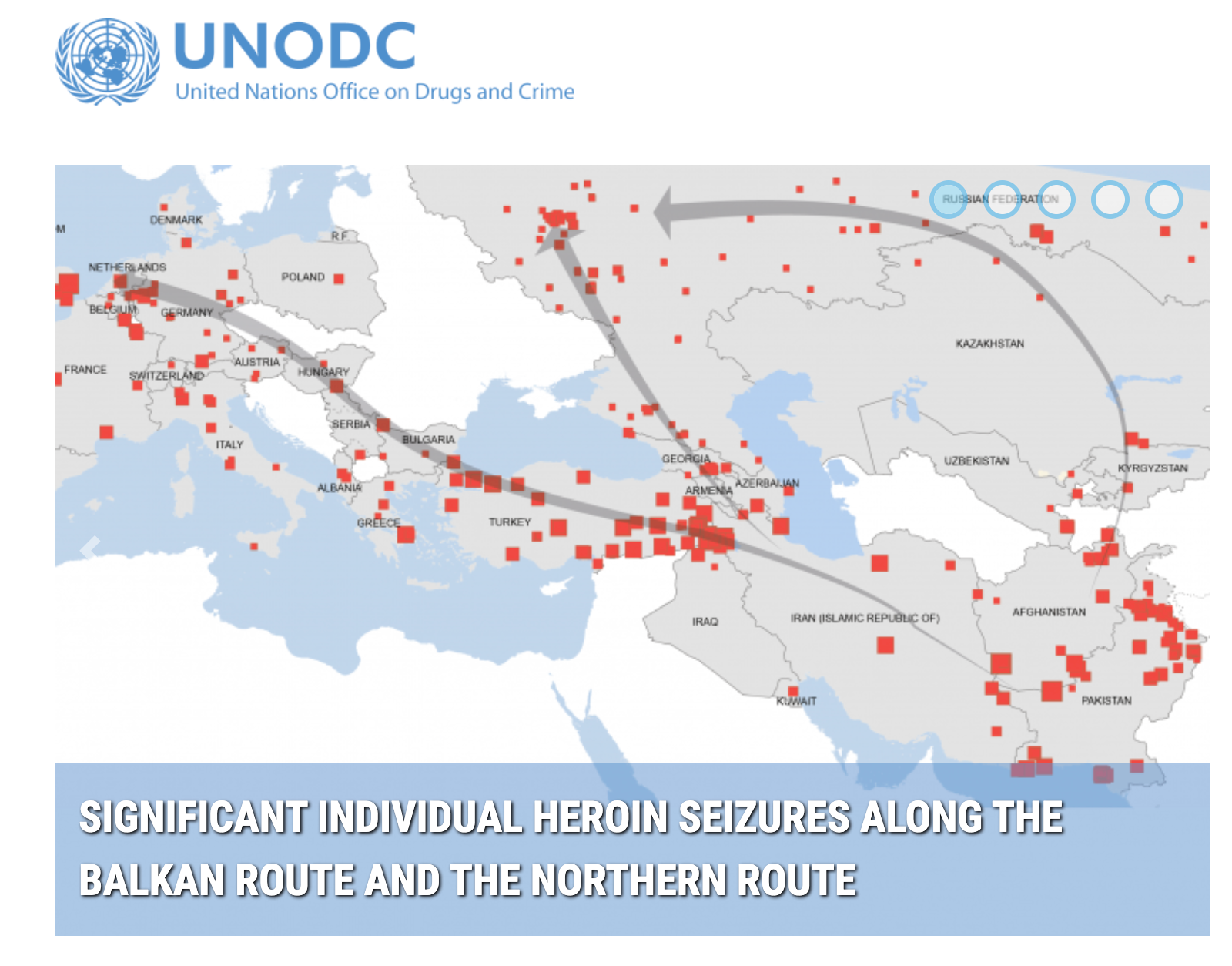
https://dmp.unodc.org/
8. Explain your metrics
For many public data sites that are focused on a particular topic, there will be a few key measures of performance. You want to ensure your visitors have a full understanding of these metrics so they can interpret the results accurately. We found many sites that do this well; others fail to provide the labeling or context to clarify what the data means.

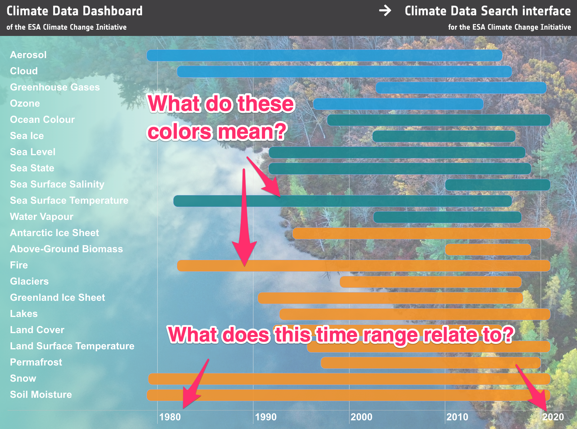
Not so good: https://climate.esa.int/en/odp/#/dashboard
9. Explain why the data is credible
There is a lot of data out there. Why should your visitor trust what they are seeing? Take the time to explain the diligent work and research that went into gathering your data.
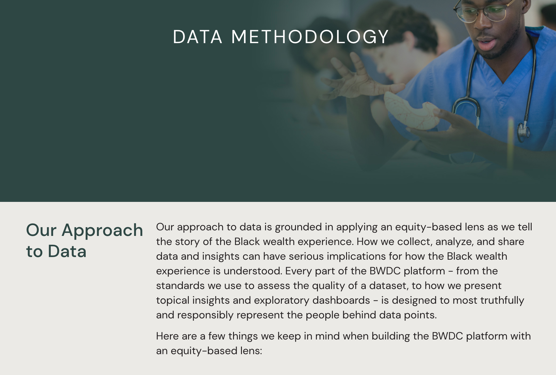
https://blackwealthdata.org/
10. Make the raw data accessibility for advanced users
For the novice data users, interactive visualizations are a great entry point into your data. The advanced users will have their own ideas about how they want to manipulate the data. You’ll want to give these users the ability to search your catalogue of data and download the raw data files.
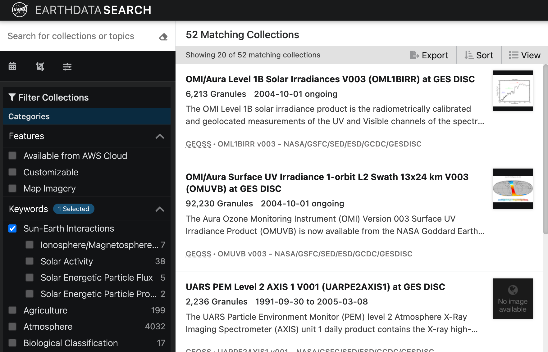
https://search.earthdata.nasa.gov/
11. Provide resources to learn more
Data is great — but it is better with context. You want to include resources that give interested visitors the chance to learn more with relate research and other content.

https://www.earthdata.nasa.gov/
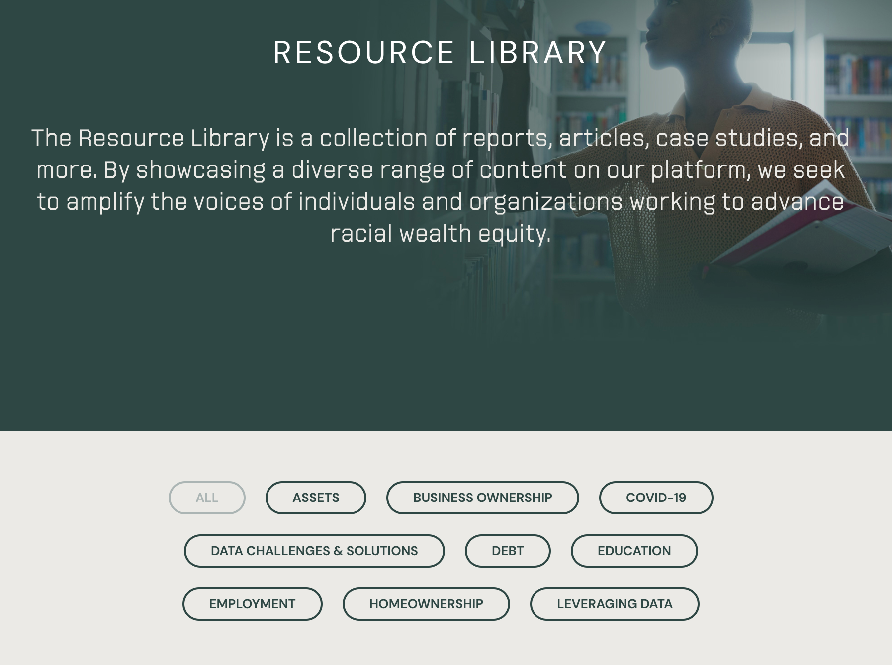
https://blackwealthdata.org/
12. Don’t forget the outreach and marketing
You’ve made an amazing public data website. The job’s not done. You need to make sure people know it exists. There are a lot of options: search advertising, organic search, social media, and lists of open data sources. A great starting point is to reach out to sites that relate to your topic area and make them aware of your data as a valuable resource.