
I’m a long-time advocate for adding specificity into data presentation as a way to humanize your message. After all, we know that “specificity is the soul of narrative” according to John Hodgman.
Specific examples are a way to zoom in to the details while connecting your audience to the big picture ideas. I ran into a couple of great examples recently that help bring specificity to this general concept (see what I did there?):
Example 1: The Hope Summit
I recently attended a workshop put on by the Belmont Data Collaborative, part of a wider Belmont event focused on “Data-Informed Social Innovation so Regions can Thrive”. The goal was to use data to drive the discussion on health disparities in our local Nashville community. In particular, the analysis focused on hypertension as a prominent health condition in economically-disadvantaged communities.
As part of the event, we created this interactive report that lets you explore how socio-economic factors correlate with health conditions. This is data analysis as a way to highlight health disparities.
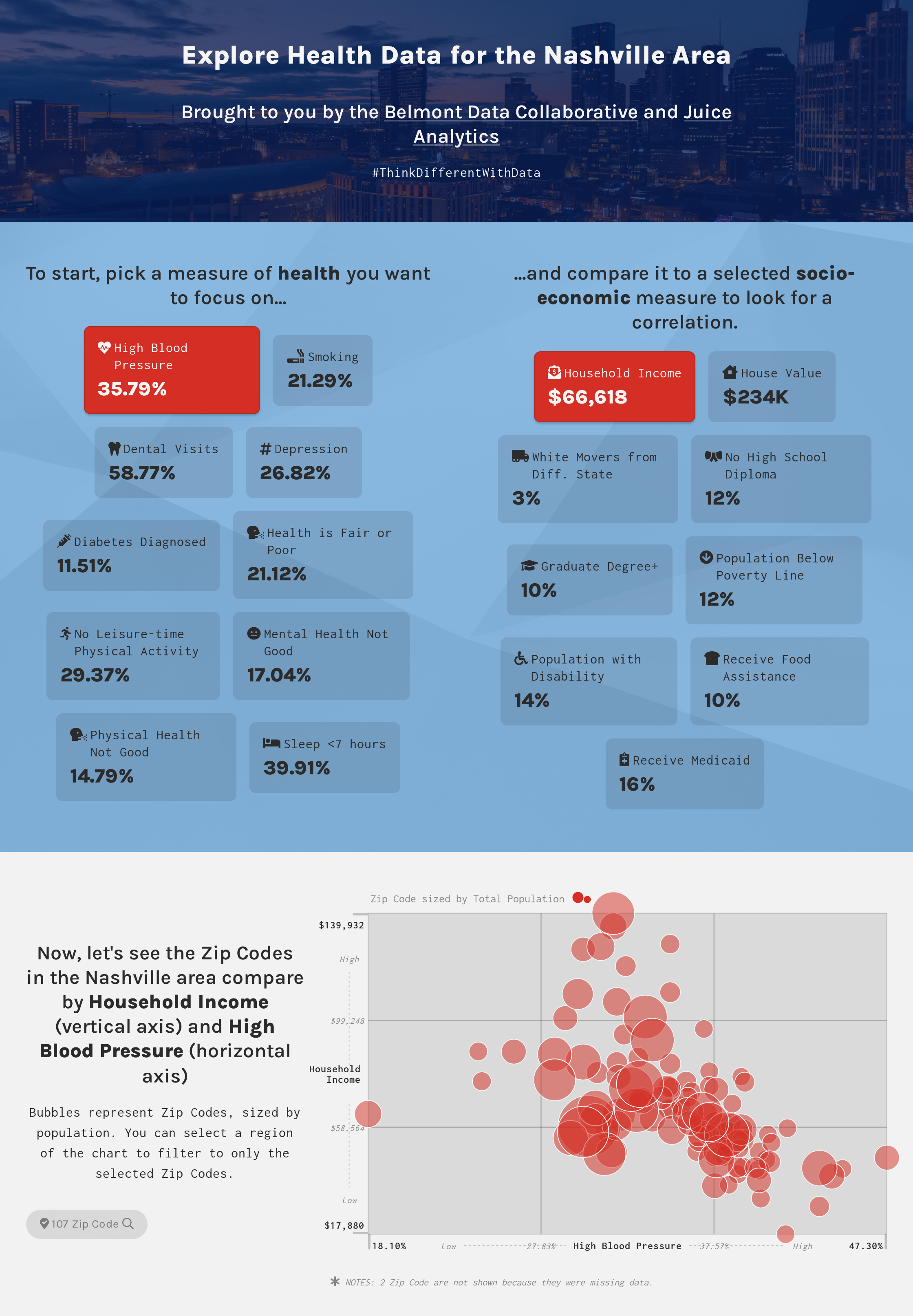
https://belmontdata.myjuicebox.io/a/hypertension_1/
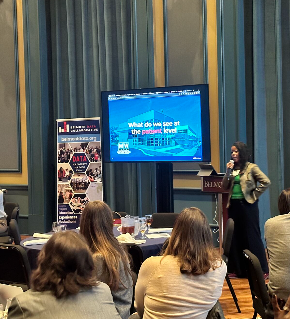
But this data story was just one layer in the layer cake of presentations that brought this challenge home to the attendees. To bring specificity to the discussion, the workshop coordinator Charlie Apigian focused on a particular zip code that has been under-resourced by the city.
A powerful presentation by Katina Beard, CEO of the Mathew Walker Comprehensive Health Center that serves the local neighborhood made the problem real. We understood that the data tells only a small slice the full picture. The stories of individual people, their struggles to find time for healthy activities or gain access to healthy food options brought insight to the conversation.
It takes Data + Context + Human Connection to create understanding of a problem.
Example 2: I am Steve.
Any big idea needs to be made human-sized for it to feel relevant. Here’s a non-data example. One of my new favorite songs is I am Steve, by the group Hey Steve from the album Steve by Steve. (How can you not love their commitment to a theme?). Take a listen:
The theme of this song is universal — you don’t need to be a Steve to feel it. It speaks to existential questions: Do other people experience life in the way I do? Do we all share the same doubts and uncertainties about life decisions? Am I making the most of my life?
Those questions offer little traction outside of a philosophy class or a dorm-room hallway. Hey Steve makes it human-sized simply by framing the questions as if there are a community of Steves in the world:
“Am I only Steve with a voice in my head?”
“Go Stevie Go Stevie, be the best Stevie you can be. Run Stevie, Run Stevie, do what you can! And if it doesn’t work, just try it again.”
In this song, the Steves relate to each other as a common group. The lens has zoomed in, the connections are closer — and as a result, we are drawn in to ponder the big questions. We are all a Steve.
These are the reasons why we created a data visualization platform that makes text and images first-class elements in data storytelling. We know that you can’t bring in specific examples and human-connection only through interactive charts. We also enabled drill-down as a default because when people look at data, they almost always want to be able to zoom in to see the details that are more actionable.
Give it a try…you can do it, Steve!