Remove dashboards-data-visualization
article thumbnail

COVID-19 Dashboard Guide: From Data Extraction to Data Visualization

FineReport

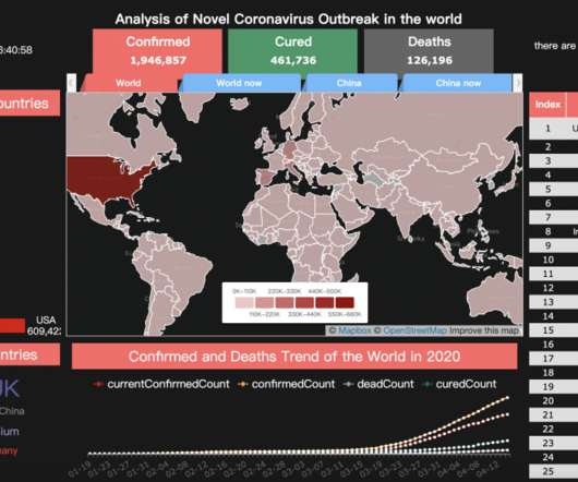
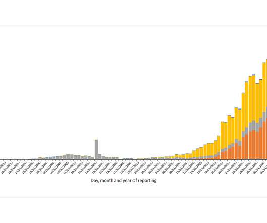
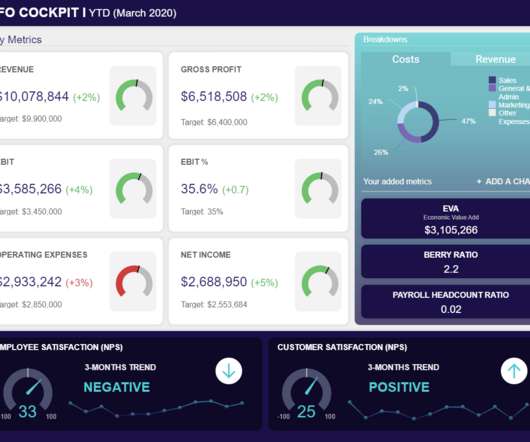
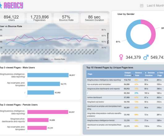
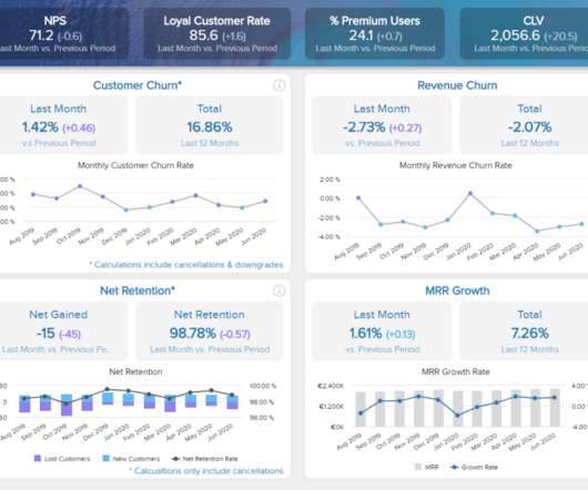
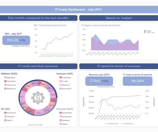
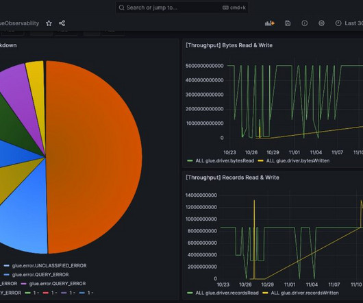
Everyone is now paying attention to the epidemic data of various places. To view the data we are concerned about more efficiently, of course, you have noticed the epidemic screens on various websites. This article will tell you how to make a dashboard of the world epidemic of various data. Download template & data.

article thumbnail

Open-Source BI Tool Metabase for Data Visualization and Analytics

Analytics Vidhya

Introduction Are you a passionate data professional exploring new tools? Try Metabase, an open-source Business Intelligence (BI) tool for creating interactive dashboards from large datasets. In today’s data-driven world, BI platforms like Metabase are essential for extracting insights and facilitating informed decision-making.

Insiders

Sign Up for our Newsletter

This site is protected by reCAPTCHA and the Google Privacy Policy and Terms of Service apply.

article thumbnail

Why Data Visualization and Dashboards Matter

Dataiku

Data teams spend a majority of their time cleaning and wrangling data in order to extract valuable business insights. The numbers should speak for themselves, so oftentimes data visualization and dashboarding is an afterthought at best or a distraction at worst.

article thumbnail

Data Engineering for Streaming Data on GCP

Analytics Vidhya

Introduction Companies can access a large pool of data in the modern business environment, and using this data in real-time may produce insightful results that can spur corporate success. Real-time dashboards such as GCP provide strong data visualization and actionable information for decision-makers.

article thumbnail

Monetizing Analytics Features: Why Data Visualizations Will Never Be Enough

Think your customers will pay more for data visualizations in your application? But today, dashboards and visualizations have become table stakes. Five years ago they may have. Discover which features will differentiate your application and maximize the ROI of your embedded analytics. Brought to you by Logi Analytics.

article thumbnail

Create Stock Exchange Dashboard using Dash in Python!

Analytics Vidhya

This article was published as a part of the Data Science Blogathon Introduction Dash is an open-source web framework for creating analytical dashboards and data visualizations. It helps data analysts to deploy dashboards and serve these dashboards to the main web application.

article thumbnail

An Introduction to Tableau on Making Raw Data Useful

Analytics Vidhya

This article was published as a part of the Data Science Blogathon. Introduction With this Tableau tutorial, you’ll learn how to visualize data and derive valuable insights from raw data, making dashboards, reports, tables, and more. Tableau is a […]. Tableau is a […].

article thumbnail

Monetizing Analytics Features

Think your customers will pay more for data visualizations in your application? But today, dashboards and visualizations have become table stakes. Five years ago, they may have. Turning analytics into a source of revenue means integrating advanced features in unique, hard-to-steal ways.

article thumbnail

Monetizing Analytics Features: Why Data Visualization Will Never Be Enough

Think your customers will pay more for data visualizations in your application? But today, dashboards and visualizations have become commonplace. Which analytics features are replacing visualizations as “the next big thing”. Five years ago they may have. You’ll learn: The 3 benefits of deeply embedding BI.

article thumbnail

The Definitive Guide to Dashboard Design

Dashboard design can mean the difference between users excitedly embracing your product or ignoring it altogether. Great dashboards lead to richer user experiences and significant return on investment (ROI), while poorly designed dashboards distract users, suppress adoption, and can even tarnish your project or brand.

article thumbnail

6 Styles of Data Analysis and Visualizations

Get inspiration for your next dashboard update in this guide to the six styles of analytics and data visualizations.