article thumbnail

PyCirclize: Circular Data Visualization, from R to Python

Analytics Vidhya

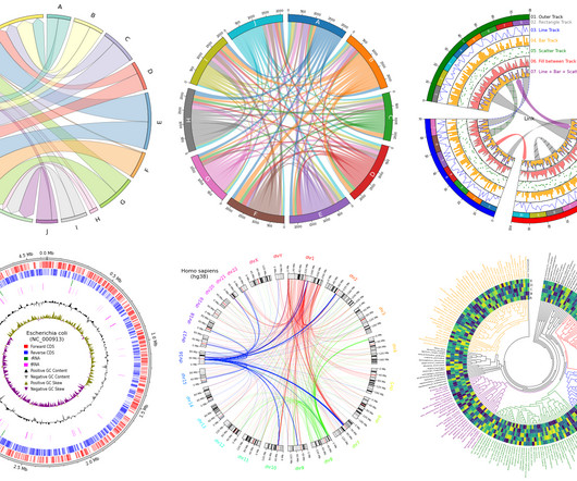
Introduction Artificial Intelligence revolutionizes various fields such as networking, multi-dimensional data exploration, genomics, and sensor data analysis, increasing the demand for advanced data visualization tools.

article thumbnail

NVIDIA’s Visual Language Model VILA Enhances Multimodal AI Capabilities

Analytics Vidhya

Fulfilling these needs, researchers at NVIDIA and MIT have recently introduced a Visual Language Model (VLM), VILA. Moreover, it facilitates in-context […] The post NVIDIA’s Visual Language Model VILA Enhances Multimodal AI Capabilities appeared first on Analytics Vidhya.

Insiders

Sign Up for our Newsletter

This site is protected by reCAPTCHA and the Google Privacy Policy and Terms of Service apply.

Trending Sources

article thumbnail

DATA VISUALIZATION : What Is This And Why It Matters

Analytics Vidhya

ArticleVideo Book This article was published as a part of the Data Science Blogathon DATA VISUALIZATION: Data Visualization is one of the parts of descriptive. The post DATA VISUALIZATION : What Is This And Why It Matters appeared first on Analytics Vidhya.

article thumbnail

The Ultimate Guide to Power BI Visualizations

Analytics Vidhya

Developed by Microsoft, Power BI Visualizations empower users to visually represent their data and disseminate insights seamlessly across organizational echelons.

article thumbnail

Monetizing Analytics Features: Why Data Visualizations Will Never Be Enough

Think your customers will pay more for data visualizations in your application? But today, dashboards and visualizations have become table stakes. Five years ago they may have. Discover which features will differentiate your application and maximize the ROI of your embedded analytics. Brought to you by Logi Analytics.

article thumbnail

ggplot in Python: A Data Visualization Guide

Analytics Vidhya

Introduction In data analysis, creating visual representations is key to understanding and communicating insights effectively. This article will dive into ggplot’s features and why it’s such a valuable tool for visualizing data […] The post ggplot in Python: A Data Visualization Guide appeared first on Analytics Vidhya.

article thumbnail

Interactive Data Visualization using rbokeh

Analytics Vidhya

Introduction Data Visualization is used to present the insights in a given dataset. The post Interactive Data Visualization using rbokeh appeared first on Analytics Vidhya. With meaningful and eye-catching charts, it becomes easier to communicate data analysis findings.

article thumbnail

Embedded Analytics Insights for 2024

Organizations look to embedded analytics to provide greater self-service for users, introduce AI capabilities, offer better insight into data, and provide customizable dashboards that present data in a visually pleasing, easy-to-access format.

article thumbnail

The Definitive Guide to Dashboard Design

Dashboard design can mean the difference between users excitedly embracing your product or ignoring it altogether. Great dashboards lead to richer user experiences and significant return on investment (ROI), while poorly designed dashboards distract users, suppress adoption, and can even tarnish your project or brand.

article thumbnail

Run a Business, Not a Backlog

Speaker: John Mecke, Managing Director of DevelopmentCorporate, Jon Gatrell, Principal Partner at Market Driven Business

Executives, Board Members, and Customer economic buyers see the world through numbers and visualizations. In this webinar you will learn: How product managers can distill market facts from the market and express them in relevant numerical and visual contexts. Numerical literacy is a key skill for effective product managers.

article thumbnail

The Beauty and Brains of Actionable Data: How to Go From Concept to Reality

Speaker: Dr. Joe Perez, Senior Systems Analyst at NC Dept. of Health & Human Services, and Chief Technology Officer at SolonTek

In this webinar, you will learn how to: Identify and recognize the five stages of the visualization spectrum. Determine how to leverage these steps into a cohesive visualization strategy. Anyone can make a pretty bar graph, but can you make sound decisions based on that graph? Is it actionable, or is it only fluff?

article thumbnail

Embedding Operational Reports: Everything Product Managers Should Know

Speaker: Dean Yao, Sr. Director of Product Marketing, Logi Analytics

World-class software teams are embedding operational reports to empower end users with interactive data visualizations, detailed information, and highly precise formats that can be shared via email, PDF, print, or online. You’ll learn: Best practices for embedding operational reports in your application.

article thumbnail

Building Best-in-Class Enterprise Analytics

Speaker: Anthony Roach, Director of Product Management at Tableau Software, and Jeremiah Morrow, Partner Solution Marketing Director at Dremio

A self-service platform for data exploration and visualization that broadens access to analytic insights. As a result of a strategic partnership, Tableau and Dremio have built a native integration that goes well beyond a traditional connector. A seamless and efficient customer experience.

article thumbnail

Collaborate Better with Your Customer-Facing Teams

Speaker: Hope Gurion, Product Leader Coach, Fearless Product LLC

Why and how to use visuals when collaborating. Customer discovery is the lifeblood of product teams to identify the most important customer needs to solve next. Often it's the Product and UX members of the trio who take lead on facilitating this discovery. But what about other customer-facing teams in an organization?