Remove 2016 Remove Metrics Remove Statistics Remove Visualization
article thumbnail

PASS Financials: past, present and the Future:

Jen Stirrup

My analysis is based on the Financial statements put forward by PASS using some basic metrics; until you do that piece, you can’t move forward to compare and contrast it with other data since you have not done your ‘descriptive statistical analysis’ first to ensure that the comparison is valid. Current Ratio.

Metrics 104
article thumbnail

The Top 20 Data Visualization Books That Should Be On Your Bookshelf

datapine

But often that’s how we present statistics: we just show the notes, we don’t play the music.” – Hans Rosling, Swedish statistician. Data visualization, or ‘data viz’ as it’s commonly known, is the graphic presentation of data. That’s a colossal number of books on visualization. Data visualization: What You Need To Know.

Insiders

Sign Up for our Newsletter

This site is protected by reCAPTCHA and the Google Privacy Policy and Terms of Service apply.

article thumbnail

Towards optimal experimentation in online systems

The Unofficial Google Data Science Blog

the weight given to Likes in our video recommendation algorithm) while $Y$ is a vector of outcome measures such as different metrics of user experience (e.g., Experiments, Parameters and Models At Youtube, the relationships between system parameters and metrics often seem simple — straight-line models sometimes fit our data well.

article thumbnail

Techniques for Collecting, Prepping, and Plotting Data: Predicting Social Media-Influence in the NBA

Domino Data Lab

As a result, there has been a recent explosion in individual statistics that try to measure a player’s impact. Knowing that the ultimate goal is to compare the social-media influence and power of NBA players, a great place to start is with the roster of the NBA players in the 2016–2017 season. 05) in predicting changes in attendance.

article thumbnail

Unlock The Power of Your Data With These 19 Big Data & Data Analytics Books

datapine

And with that understanding, you’ll be able to tap into the potential of data analysis to create strategic advantages, exploit your metrics to shape them into stunning business dashboards , and identify new opportunities or at least participate in the process. It was lately revised and updated in January 2016.

Big Data 263
article thumbnail

Adding Common Sense to Machine Learning with TensorFlow Lattice

The Unofficial Google Data Science Blog

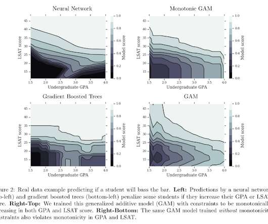
On the one hand, basic statistical models (e.g. As a result, selecting knots according to the quantiles of the input data (or even linearly across the domain), and then steadily increasing their number as long as the metrics improve works well in practice. linear regression, trees) can be too rigid in their functional forms.

article thumbnail

Deep Learning Illustrated: Building Natural Language Processing Models

Domino Data Lab

Although it’s not perfect, [Note: These are statistical approximations, of course!] Human brains are not well suited to visualizing anything in greater than three dimensions. Visualizing data using t-SNE. Example 11.6 Detecting collocated bigrams with more conservative thresholds. Joulin, A., arXiv: 1607.01759. Bojanowski, P.,