Remove creating-reports-for-grant-deliverables-using-excel-dashboards
article thumbnail

Creating Reports for Grant Deliverables Using Excel Dashboards

Depict Data Studio

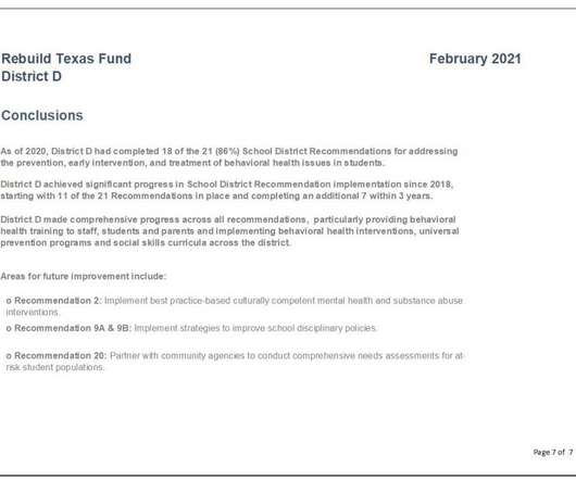
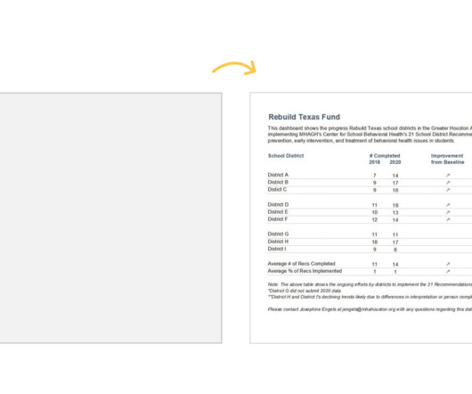
She enrolled in our Dashboard Design course and is sharing how she uses her new skills in real life. — Are you tired of text heavy reports to summarize grant findings? Do you want to update the look and feel of your reporting templates? Dashboard Design Course Comes to the Rescue.

article thumbnail

Don’t Start from Scratch! Make One of these Dashboards Instead

Depict Data Studio

Dashboards aren’t supposed to take forever. Dashboards are supposed to be fast and easy. In this article, you’ll see examples of real dashboards that you can use as inspiration for your own workplace. Adapt one of these dashboards instead. They’re not supposed to cost an arm and a leg.

Insiders

Sign Up for our Newsletter

This site is protected by reCAPTCHA and the Google Privacy Policy and Terms of Service apply.

article thumbnail

Top 22 Dataviz Resources of 2022

Depict Data Studio

What Makes a Useful Data Story? 5 Questions to Ask : If you’ve been analyzing data for decades, then you already know how to spot useful nuggets that deserve to get graphed. What Type of Dashboard Do We Need? 7,700 total participants in my dataviz courses so far. 29 new blog posts : 20 from me, and 9 from guest authors.

article thumbnail

My 6 Data Communications Classes

Depict Data Studio

Two classes focus on core data visualization skills (translating technical information for non-technical audiences; making sure we don’t just have bar charts; and using colors and fonts that are branded, accessible, and intuitive). I call them deep dives because they focus just on reports, or dashboards, or presentations.