Remove Dashboards Remove Data Enablement Remove Interactive Remove Visualization
article thumbnail

Exploring Data Wonders: Data Visualization Examples & Considerations

FineReport

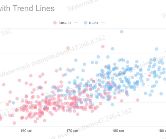
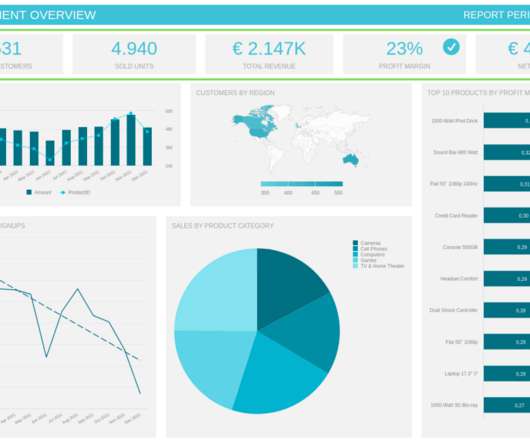
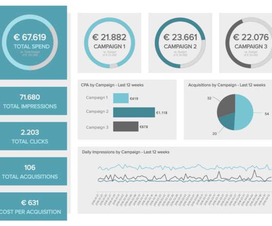
As the realm of data visualization undergoes rapid proliferation, diversifying applications, and evolving presentation formats, its expansive landscape unfolds. Mirroring the growth seen in other emerging concepts, the boundaries of data visualization remain in a state of continual expansion and is vital when you generate reports.

article thumbnail

Understanding Data Drill Down And Drill Through Analysis And Their Role In Efficient Reporting

datapine

From automated reporting, predictive analytics, and interactive data visualizations, reporting on data has never been easier. Now, if you are just getting started with data analysis and business intelligence it is important that you are informed about the most efficient ways to manage your data.

Reporting 173
Insiders

Sign Up for our Newsletter

This site is protected by reCAPTCHA and the Google Privacy Policy and Terms of Service apply.

Trending Sources

article thumbnail

10 Examples of How Big Data in Logistics Can Transform The Supply Chain

datapine

The rise of SaaS business intelligence tools is answering that need, providing a dynamic vessel for presenting and interacting with essential insights in a way that is digestible and accessible. The future is bright for logistics companies that are willing to take advantage of big data.

Big Data 275
article thumbnail

Take Advantage Of Operational Metrics & KPI Examples – A Comprehensive Guide

datapine

We have written about management reporting methods that can be utilized in the modern practice of creating powerful analysis, bringing complex data into simple visuals, and employ them to make actionable decisions. Your Chance: Want to visualize & track operational metrics with ease? Marketing: CPA (Cost-per-Acquisition).

KPI 269
article thumbnail

Your Ultimate Guide To Modern KPI Reports In The Digital Age – Examples & Templates

datapine

Typically presented in the form of an interactive dashboard , this kind of report provides a visual representation of the data associated with your predetermined set of key performance indicators – or KPI data, for short. Consider your data sources. Now, let’s look at how to create a KPI report.

KPI 223
article thumbnail

Are You Harnessing the Power of SaaS BI Tools for Dynamic Data Access?

FineReport

When combined, SaaS BI tools enable users to conduct comprehensive data analysis using modern cloud BI technology , providing access to all data sources and the ability to compile online dashboards from mobile devices.

article thumbnail

Move Beyond Excel, PowerPoint And Static Business Reporting with Powerful Interactive Dashboards

datapine

Soon businesses of all sizes will have so much amount of information that dashboard software will be the most invaluable resource a company can have. Visualizing the data and interacting on a single screen is no longer a luxury but a business necessity. Your Chance: Want to test interactive dashboard software for free?