Remove Dashboards Remove Snapshot Remove Uncertainty Remove Visualization
article thumbnail

iostudio delivers key metrics to public sector recruiters with Amazon QuickSight

AWS Big Data

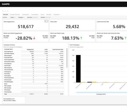
We wanted to include interactive, real-time visualizations to support recruiters from one of our government clients. Our previous solution offered visualization of key metrics, but point-in-time snapshots produced only in PDF format.

Metrics 96
article thumbnail

COVID-19 Data Spreads like a Virus

Juice Analytics

Not to minimize the severity of our situation, but the explosion of numbers, charts, dashboards and data stories is beginning to feel like a pandemic of its own. As things have it, the Johns Hopkins University dashboard quickly became the de facto standard, and as a result gets a billion views a day. ONE BILLION!! And it’s crap.)

article thumbnail

How Microsoft is Reactivating its Workforce During The Pandemic

Timo Elliott

And we started creating dashboards of the situation within each location around the world, and we got into a regular rhythm of triaging the situation and figuring out what we needed to do along the way. As you know, we have a strong set of capabilities around Power BI to be able to create dashboards.

IT 71