Remove Data Enablement Remove Data Processing Remove Statistics Remove Visualization
article thumbnail

Your Ultimate Guide To Modern KPI Reports In The Digital Age – Examples & Templates

datapine

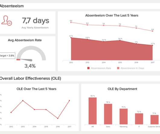
Typically presented in the form of an interactive dashboard , this kind of report provides a visual representation of the data associated with your predetermined set of key performance indicators – or KPI data, for short. Consider your data sources. Set up a report which you can visualize with an online dashboard.

KPI 223
article thumbnail

Quantitative and Qualitative Data: A Vital Combination

Sisense

Let’s consider the differences between the two, and why they’re both important to the success of data-driven organizations. Digging into quantitative data. This is quantitative data. It’s “hard,” structured data that answers questions such as “how many?” The challenge comes when the data becomes huge and fast-changing.

Insiders

Sign Up for our Newsletter

This site is protected by reCAPTCHA and the Google Privacy Policy and Terms of Service apply.

Trending Sources

article thumbnail

Periscope Data Expands to Israel, Empowering Data Teams with Powerful Tools

Sisense

The challenge is to do it right, and a crucial way to achieve it is with decisions based on data and analysis that drive measurable business results. This was the key learning from the Sisense event heralding the launch of Periscope Data in Tel Aviv, Israel — the beating heart of the startup nation. What VCs want from startups.

article thumbnail

The Gartner 2021 Leadership Vision for Data & Analytics Leaders Webinar Q&A

Andrew White

On January 4th I had the pleasure of hosting a webinar. It was titled, The Gartner 2021 Leadership Vision for Data & Analytics Leaders. This was for the Chief Data Officer, or head of data and analytics. Coding skills – SQL, Python or application familiarity – ETL & visualization?