Remove Data Processing Remove Snapshot Remove Strategy Remove Visualization
article thumbnail

Your Introduction To CFO Dashboards & Reports In The Digital Age

datapine

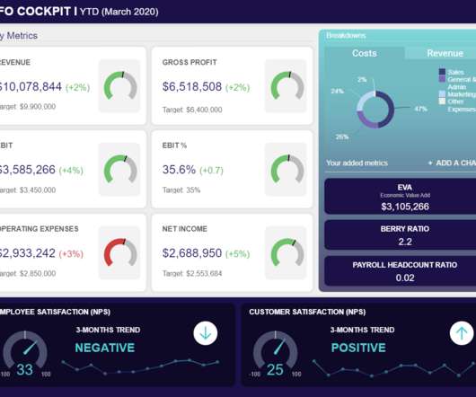
Not only are you responsible for the ongoing financial strategy of your organization, but you’re probably expected to provide timely, accurate reports to a variety of stakeholders. The berry ratio is a CFO KPI that visualizes and quantifies the ratio of gross profit in relation to operating expenses. We offer a 14-day free trial.

article thumbnail

Take Advantage Of The Top 16 Sales Graphs And Charts To Boost Your Business

datapine

Download our free executive summary and boost your sales strategy! This gives to that sales graph an overall sense of visual contrast which makes it much more digestible at a glance. Download our free executive summary and boost your sales strategy! Download our free executive summary and boost your sales strategy!

Sales 235
Insiders

Sign Up for our Newsletter

This site is protected by reCAPTCHA and the Google Privacy Policy and Terms of Service apply.

article thumbnail

Your Definitive Guide To Building Valuable Narratives Through Data Storytelling

datapine

By gaining centralized access to business data and presenting it in a visual way that follows a logical path and provides invaluable insights on a particular area or subject, you stand to set yourself apart from your competitors and become a leader in your field. Data storytelling has a host of business-boosting benefits.

KPI 193
article thumbnail

10 Examples of How Big Data in Logistics Can Transform The Supply Chain

datapine

Using the right dashboard and data visualizations, it’s possible to hone in on any trends or patterns that uncover inefficiencies within your processes. This isn’t just valuable for the customer – it allows logistics companies to see patterns at play that can be used to optimize their delivery strategies. million miles.

Big Data 275
article thumbnail

Best Dashboard Ideas & Design Examples To Boost Your Business Success

datapine

The ability to monitor, visualize, and analyze relevant data gives today’s businesses, across a host of sectors, the power to understand their prospects, make informed decisions, increase efficiencies, and work towards a set of rewarding long term goals. Best Dashboard Ideas You Can Get Inspiration From.

article thumbnail

Utilize The Effectiveness Of Professional Executive Dashboards & Reports

datapine

Modern executive reporting consolidates key business metrics while outlining problems and solutions in which KPI dashboards are used to provide additional insights and serve as an added visual representation that usually lacks in executive reports and summaries. 90% of the information transmitted to the brain is visual.

article thumbnail

Your Ultimate Guide To Modern KPI Reports In The Digital Age – Examples & Templates

datapine

Typically presented in the form of an interactive dashboard , this kind of report provides a visual representation of the data associated with your predetermined set of key performance indicators – or KPI data, for short. Set up a report which you can visualize with an online dashboard. Now, let’s look at how to create a KPI report.

KPI 223