Remove Document Remove Interactive Remove Slice and Dice Remove Visualization
article thumbnail

Faster data exploration in Jupyter through Lux

Domino Data Lab

They offer a clear way to collaborate with others throughout the process of data exploration, feature engineering and model fitting and through utilizing some clear best practices , can also become living documents of how that code operates. Saving visualizations in Lux. df = pd.read_csv("/mnt/data/wine_red.csv",sep=';') df.

article thumbnail

Documenting and Managing Governance, Risk and Compliance with Business Process

erwin

Shockingly, a lot of organizations, even today, manage this through, either homemade tools or documents, checklists, Excel files, custom-made databases and so on and so forth. Traditionally, these are manually documented, monitored and managed. Everything needs to be clearly documented, covering all important and relevant aspects.

Risk 98
Insiders

Sign Up for our Newsletter

This site is protected by reCAPTCHA and the Google Privacy Policy and Terms of Service apply.

Trending Sources

article thumbnail

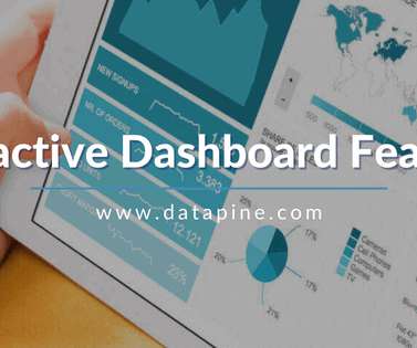
Move Beyond Excel, PowerPoint And Static Business Reporting with Powerful Interactive Dashboards

datapine

Visualizing the data and interacting on a single screen is no longer a luxury but a business necessity. That’s why we welcome you to the world of interactive dashboards. But before we delve into the bits and pieces of our topic, let’s answer the basic questions: What is an interactive dashboard, and why you need one?

article thumbnail

How Model Observability Provides a 360° View of Models in Production

DataRobot Blog

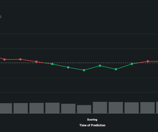
You also need visibility into prediction requests and the ability to slice and dice prediction data over time to have a complete understanding of the internal state of your AI/ML system. Visualize Data Drift Over Time to Maintain Model Integrity. DataRobot MLOps offers user-friendly visuals to track data drift over time.

article thumbnail

The Data Journey: From Raw Data to Insights

Sisense

They hold structured data from relational databases (rows and columns), semi-structured data ( CSV , logs, XML , JSON ), unstructured data (emails, documents, PDFs), and binary data (images, audio , video). Dimension tables include information that can be sliced and diced as required for customer analysis ( date, location, name, etc.).

article thumbnail

Data Visualization Inspiration: Analysis To Insights To Action, Faster!

Occam's Razor

Like a vast majority on planet Earth, I love data visualizations. A day-to-day manifestation of this love is on my Google+ or Facebook profiles where 75% of my posts are related to my quick analysis and learnings from a visualization. Data visualized is data understood. Short story #4: Multi-dimensional Slicing and Dicing!

article thumbnail

What Is Embedded Analytics?

Jet Global

Plus, there is an expectation that tools be visually appealing to boot. In the past, data visualizations were a powerful way to differentiate a software application. Their dashboards were visually stunning. Today, free visualizations seem to be everywhere. Users’ varied needs require a shift in traditional BI thinking.