Remove how-to-make-great-graphs-in-excel-4-levels-of-excel-vizardry
article thumbnail

How to Make Great Graphs in Excel: 4 Levels of Excel Vizardry

Depict Data Studio

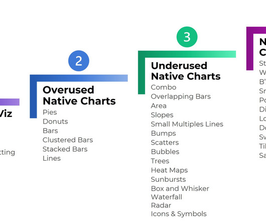
Are you drowning in the deep end of Excel? 4 Levels of Excel Vizardry I’ve taught data visualization in Excel a dozen different ways over the years. Nowadays, I teach Excel dataviz based on the degree of behind-the-scenes hacking needed to produce that chart. Easy to make!

article thumbnail

Top 23 Dataviz Resources of 2023

Depict Data Studio

32 new blog posts : 28 from me , and 4 from guest authors. The Progression of Sue Griffey’s Year-End Infographic : Sue Griffey explained how she edited her infographic and we discussed it together during Office Hours. This is a great listen for people who are new to my work. 2 more YouTube videos (115 total). 2 more babies.

article thumbnail

My 6 Data Communications Classes

Depict Data Studio

One class focuses on data analysis (cleaning and tabulating our raw datasets to get them ready for graphs). You’ll need to have your graphs created and edited first (skills taught in previous classes) so they can feed into those reports, dashboards, and presentations. Did you know… that I teach six different classes?