Remove 2012 Remove Snapshot Remove Statistics Remove Visualization
article thumbnail

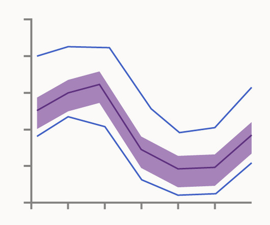
Chart Snapshot: Functional Box Plots

The Data Visualisation Catalogue

While this visualisation technique is a variation of the classic Box Plot , a Functional Box Plot is visually very different and instead plots a combination of lines and areas to communicate the various data ranges. Median Curve: The median curve represents the most central observation and serves as a robust statistic for centrality.

article thumbnail

Use Apache Iceberg in your data lake with Amazon S3, AWS Glue, and Snowflake

AWS Big Data

AWS Glue is a serverless data integration service that allows you to visually create, run, and monitor extract, transform, and load (ETL) pipelines to load data into your data lakes in Iceberg format. Snowflake integrates with AWS Glue Data Catalog to retrieve the snapshot location.

article thumbnail

Amazon DataZone now integrates with AWS Glue Data Quality and external data quality solutions

AWS Big Data

We discuss how to visualize data quality scores in Amazon DataZone, enable AWS Glue Data Quality when creating a new Amazon DataZone data source, and enable data quality for an existing data asset. If the asset has AWS Glue Data Quality enabled, you can now quickly visualize the data quality score directly in the catalog search pane.