Remove 2014 Remove Measurement Remove Risk Remove Statistics
article thumbnail

Optimizing clinical trial site performance: A focus on three AI capabilities

IBM Big Data Hub

In an ideal scenario, they would be able to, with relative and consistent accuracy, predict performance of clinical trial sites that are at risk of not meeting their recruitment expectations. A mitigation plan facilitates trial continuity by providing contingency measures and alternative strategies.

article thumbnail

Our quest for robust time series forecasting at scale

The Unofficial Google Data Science Blog

First, the system may not be understood, and even if it was understood it may be extremely difficult to measure the relationships that are assumed to govern its behavior. Such a model risks conflating important aspects, notably the growth trend, with other less critical aspects.

Insiders

Sign Up for our Newsletter

This site is protected by reCAPTCHA and the Google Privacy Policy and Terms of Service apply.

article thumbnail

To Balance or Not to Balance?

The Unofficial Google Data Science Blog

A naïve comparison of the exposed and unexposed groups would produce an overly optimistic measurement of the effect of the ad, since the exposed group has a higher baseline likelihood of purchasing a pickup truck. Identification We now discuss formally the statistical problem of causal inference. we drop the $i$ index.

article thumbnail

Towards optimal experimentation in online systems

The Unofficial Google Data Science Blog

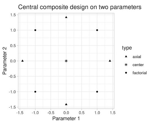
the weight given to Likes in our video recommendation algorithm) while $Y$ is a vector of outcome measures such as different metrics of user experience (e.g., Taking measurements at parameter settings further from control parameter settings leads to a lower variance estimate of the slope of the line relating the metric to the parameter.

article thumbnail

Discover 20 Essential Types Of Graphs And Charts And When To Use Them

datapine

2) Charts And Graphs Categories 3) 20 Different Types Of Graphs And Charts 4) How To Choose The Right Chart Type Data and statistics are all around us. That said, there is still a lack of charting literacy due to the wide range of visuals available to us and the misuse of statistics. Table of Contents 1) What Are Graphs And Charts?

article thumbnail

Designing Charts and Graphs: How to Choose the Right Data Visualization Types

datapine

In our example above, we are showing Sales by Payment Method for all of 2014. In the example above, the story isn’t about the total number of customers aged 15-25, but that 22% of the customers were 15-25 in the first quarter of 2014 (and 26% in Q4). With a table, you can display a large number of precise measures and dimensions.