Remove 2014 Remove Metrics Remove Predictive Modeling Remove Visualization
article thumbnail

Data Visualization Inspiration: Analysis To Insights To Action, Faster!

Occam's Razor

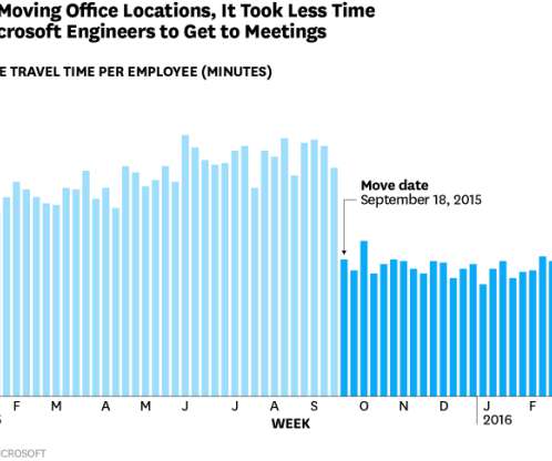
Like a vast majority on planet Earth, I love data visualizations. A day-to-day manifestation of this love is on my Google+ or Facebook profiles where 75% of my posts are related to my quick analysis and learnings from a visualization. Data visualized is data understood. But for a visual person like me, this is the ah-ha moment.

article thumbnail

6 Case Studies on The Benefits of Business Intelligence And Analytics

datapine

BI users analyze and present data in the form of dashboards and various types of reports to visualize complex information in an easier, more approachable way. What’s more, visualizing their data helped them see how much revenue a given seat is producing during a season, and compare the different areas of the stadium.

Insiders

Sign Up for our Newsletter

This site is protected by reCAPTCHA and the Google Privacy Policy and Terms of Service apply.

Trending Sources

article thumbnail

Explaining black-box models using attribute importance, PDPs, and LIME

Domino Data Lab

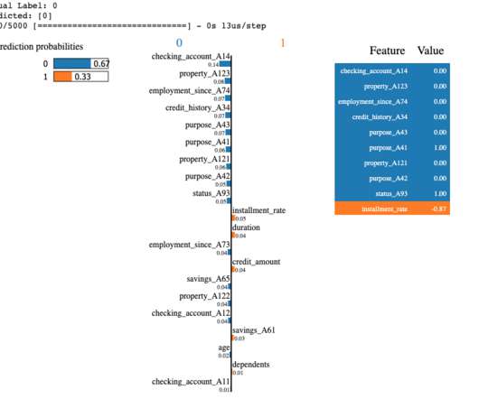
Because of its architecture, intrinsically explainable ANNs can be optimised not just on its prediction performance, but also on its explainability metric. In this article we’ll use Skater , a freely available framework for model interpretation, to illustrate some of the key concepts above. Erhan, Yoshua Bengio, Aaron C.

Modeling 139
article thumbnail

Deep Learning Illustrated: Building Natural Language Processing Models

Domino Data Lab

At the time—in 2014—the three were colleagues working. GloVe and word2vec differ in their underlying methodology: word2vec uses predictive models, while GloVe is count based. Human brains are not well suited to visualizing anything in greater than three dimensions. Visualizing data using t-SNE. Pennington, J.,