Remove 2015 Remove Interactive Remove Metrics Remove Visualization
article thumbnail

Top 10 Management Reporting Best Practices To Create Effective Reports

datapine

When these reports are backed up with powerful visualizations developed with a dashboard creator , no information can stay hidden, eliminating thus the possibility of human errors and negative business impact. Let’s now go over the history of these reports, where they come from and how they have been developed. They’re also slow.

Reporting 263
article thumbnail

A Guide To Starting A Career In Business Intelligence & The BI Skills You Need

datapine

For example, if you enjoy computer science, programming, and data but are too extroverted to program all day long, you could work in a more human-oriented area of intelligence for business, perhaps involving more face-to-face interactions than most programmers would encounter on the job. b) If You’re Already In The Workforce.

Insiders

Sign Up for our Newsletter

This site is protected by reCAPTCHA and the Google Privacy Policy and Terms of Service apply.

article thumbnail

Take Advantage Of The Best Interactive & Effective Data Visualization Examples

datapine

Table of Contents 1) The Benefits Of Data Visualization 2) Our Top 27 Best Data Visualizations 3) Interactive Data Visualization: What’s In It For Me? 4) Static vs. Animated Data Visualization Data is the new oil? ” – David McCandless Humans are visual creatures. No, data is the new soil.”

article thumbnail

Towards optimal experimentation in online systems

The Unofficial Google Data Science Blog

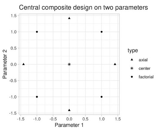
the weight given to Likes in our video recommendation algorithm) while $Y$ is a vector of outcome measures such as different metrics of user experience (e.g., Experiments, Parameters and Models At Youtube, the relationships between system parameters and metrics often seem simple — straight-line models sometimes fit our data well.

article thumbnail

How Amazon Devices scaled and optimized real-time demand and supply forecasts using serverless analytics

AWS Big Data

You can visually create, run, and monitor extract, transform, and load (ETL) pipelines to load data into your data lakes. AWS Glue Data Catalog The Data Catalog helped us maintain the catalog as an index to the data’s location, schema, and runtime metrics in Amazon S3. When successful, you can query the output in an S3 file or via API.

article thumbnail

Tableau Grows Up!

Rita Sallam

The vision revealed in the keynote had an unmistakable emphasis on the enterprise, but as the market for visual-based data discovery is mainstreaming, Tableau also laid a foundation for building a next generation, ‘smart’ BIA platform. What’s on Deck for 2017? Enterprise Features. Tableau for Linux!! Tableau for Linux!! Time will tell.

article thumbnail

See-Think-Do: A Content, Marketing, Measurement Business Framework

Occam's Razor

My solution to these problems was to create a simple framework we can use to put our customers first, evaluate our marketing programs, and right-align our view of success (metrics). What about grabbing the incredible mobile opportunity by the throat and truly delivering for utility marketing and executing for mobile 2015 ?