Remove 2020 Remove Key Performance Indicator Remove KPI Remove Visualization
article thumbnail

SaaS Dashboard Examples For Modern Business Management Practices

datapine

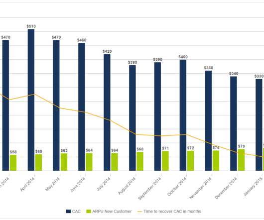
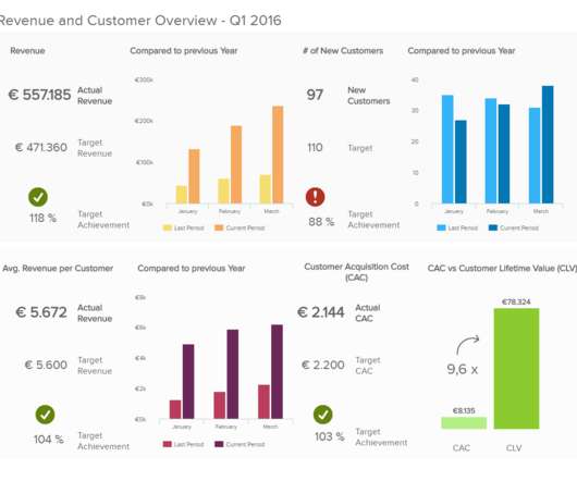
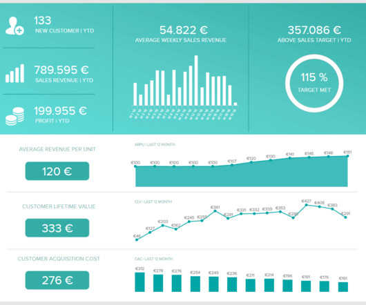
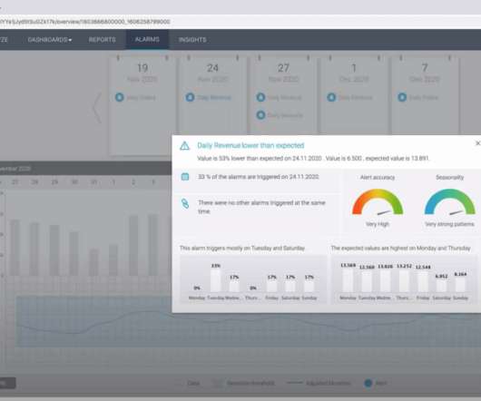
Software as a service (SaaS) has blossomed in the last five years, and the public SaaS market is expected to grow to $76 billion by the year 2020, according to FinancesOnline. A SaaS KPI dashboard will help you do just that. What Is A SaaS Dashboard? Why Do You Need A SaaS Dashboard?

article thumbnail

An Introduction To Data Dashboards: Meaning, Definition & Industry Examples

datapine

According to the EMC Digital Universe study, by 2020, around 40 trillion megabytes – or 40 zettabytes – will exist in our digital landscape. These are measured through Key Performance Indicators (KPIs), which provide insights that help to foster growth and improvement. Lack of different data visualization types.

Insiders

Sign Up for our Newsletter

This site is protected by reCAPTCHA and the Google Privacy Policy and Terms of Service apply.

article thumbnail

CCPA 2020: Getting Your Data Landscape Ready

Octopai

federal data privacy laws on top of an alphabet soup of global laws and regulations, the name of the game for 2020 is going to be “compliance.”. Here are some things you should have on your radar as you prepare your data landscape for 2020: California Consumer Privacy Act. Make 2020 the Year of Automated Metadata Management.

article thumbnail

Discover The Power Of Modern Performance Reports – See Examples & Best Practices 

datapine

Keep reading to find a definition, benefits, examples, and some key best practices to generate them successfully! What Is A Performance Report? A performance report is an analytical tool that offers a visual overview of how a business is performing in a specific strategy, project, or department.

Reporting 207
article thumbnail

13 Essential Data Visualization Techniques, Concepts & Methods To Improve Your Business – Fast

datapine

“By visualizing information, we turn it into a landscape that you can explore with your eyes. 90% of the information transmitted to the brain is visual. Data visualization methods refer to the creation of graphical representations of information. That’s where data visualization comes in. A sort of information map.

article thumbnail

Everything You Need To Know To Get Started With Helpdesk KPIs

datapine

In today’s business world, competition is fierce across all industries and sectors, which means that to survive and thrive, working with measurable online data analysis and performance metrics is essential. Working with service desk metrics and KPI reports will help you make the improvements you need for continual growth and success.

KPI 169
article thumbnail

Your Modern Business Guide To Data Analysis Methods And Techniques

datapine

Once you’ve set your data sources, started to gather the raw data you consider to offer potential value, and established clearcut questions you want your insights to answer, you need to set a host of key performance indicators (KPIs) that will help you track, measure, and shape your progress in a number of key areas.