Remove Analytics Remove Interactive Remove ROI Remove Snapshot
article thumbnail

Take Advantage Of The Top 16 Sales Graphs And Charts To Boost Your Business

datapine

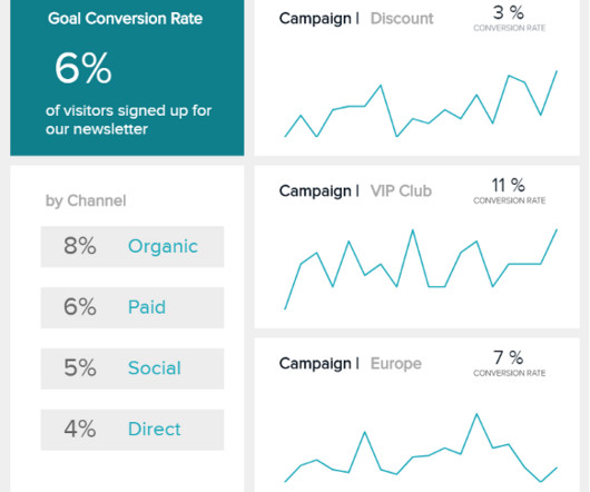
Number 6 on our list is a sales graph example that offers a detailed snapshot of sales conversion rates. Yes, no sales team is perfect, and you can always get better at any of these areas, but this graph will help you to identify the “low hanging fruit” where you can invest a little bit of effort to get a large ROI.

Sales 235
article thumbnail

Top 10 Management Reporting Best Practices To Create Effective Reports

datapine

Managerial reports use a lot of the same data as financial reports, but presented in a more useful way, for example via interactive management dashboards. However, the use of dashboards, big data, and predictive analytics is changing the face of this kind of reporting. Who are my most profitable clients?

Reporting 263
Insiders

Sign Up for our Newsletter

This site is protected by reCAPTCHA and the Google Privacy Policy and Terms of Service apply.

article thumbnail

Getting Started With Incremental Sales – Best Practices & Examples

datapine

Explore our sales analytics software for a 14-days free trial today! These relate to direct actions you should take such as knowing your customer preferences and being aware of any major market changes, but also to the analytics process such as tracking the right metrics and defining clear goals beforehand.

Sales 176
article thumbnail

Get Started With Business Performance Dashboards – Examples & Templates

datapine

All areas of your modern-day business – from supply chain success to improved reporting processes and communications, interdepartmental collaboration, and general organization innovation – can benefit significantly from the use of analytics, structured into a live dashboard that can improve your data management efforts. Interactivity.

article thumbnail

How To Make Stunning Dashboards & Take Your Decision Making To The Next Level

datapine

If you want to convey crucial information to decision-makers in the easiest and most effective way possible, you need to embrace the power of interactive dashboards. At datapine, we believe the goal of each interactive dashboard you create should be better, faster, and stronger decision making while telling a story. Logistics Example.

article thumbnail

Utilize The Effectiveness Of Professional Executive Dashboards & Reports

datapine

Without big data analytics, companies are blind and deaf, wandering out onto the Web like deer on a freeway. Companies that use data analytics are five times more likely to make faster decisions, based on a survey conducted by Bain & Company. Geoffrey Moore, Author of Crossing the Chasm & Inside the Tornado.

article thumbnail

Move Beyond Excel, PowerPoint And Static Business Reporting with Powerful Interactive Dashboards

datapine

Visualizing the data and interacting on a single screen is no longer a luxury but a business necessity. That’s why we welcome you to the world of interactive dashboards. But before we delve into the bits and pieces of our topic, let’s answer the basic questions: What is an interactive dashboard, and why you need one?