Remove Dashboards Remove Statistics Remove Visualization Remove Workshop
article thumbnail

Digital Dashboard: Make You Prosper In Digital Era

FineReport

No need to be worried anymore, all these management problems could be settled with digital dashboard. Digital dashboard: definition & benefits. Digital dashboard is one of the forms of applying business intelligence in reality. Workshop application of FineReport’s digital dashboard. Digital dashboard software.

article thumbnail

Join me at Live! 360 Orlando to learn more about Applied Business Analytics

Jen Stirrup

360 Orlando and I’m presenting a workshop on From Business Intelligence to Business Analytics with the Microsoft Data Platform. Data becomes relevant for decision making when we start to use it properly, so this workshop will demonstrate the use of analytics for real-life use cases.

Insiders

Sign Up for our Newsletter

This site is protected by reCAPTCHA and the Google Privacy Policy and Terms of Service apply.

article thumbnail

How to Make Great Graphs in Excel: 4 Levels of Excel Vizardry

Depict Data Studio

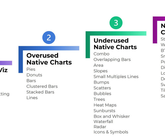
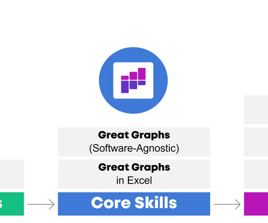
4 Levels of Excel Vizardry I’ve taught data visualization in Excel a dozen different ways over the years. Level 5 would be adapting those charts for specific contexts, like for interactive dashboards. I love starting private workshops and online courses with exploratory viz. There are dozens more statistical approaches!

article thumbnail

Improve reliability and reduce costs of your Apache Spark workloads with vertical autoscaling on Amazon EMR on EKS

AWS Big Data

The data, fetched from the Kubernetes Metric Server, feeds into statistical models that VPA constructs in order to build recommendations. The statistical models, which also represent historic resource utilization data are stored as custom resource objects on your EKS cluster.

Metrics 75
article thumbnail

Celebrating 10 Years of Dataviz YouTubing!

Depict Data Studio

” I’d been a formal statistics tutor and Spanish tutor in college through a small invite-only program. Instead, I’ve focused on mastery and quality : leading the best private workshops I can, creating the best online course experience I can, and producing the best public resources like blog posts and YouTube videos that I can.

article thumbnail

How to Design Reports that Actually Inform Decisions

Depict Data Studio

I used to write hundred-page reports… I was trained to write lengthy reports filled with statistical jargon. ” aim for 1+ visual per page; add 15+ styles of visuals using my checklist; go beyond the bar chart; lower the reading grade level of your writing; and tell a story through dark-light contrast and takeaway text.

article thumbnail

My 6 Data Communications Classes

Depict Data Studio

Two classes focus on core data visualization skills (translating technical information for non-technical audiences; making sure we don’t just have bar charts; and using colors and fonts that are branded, accessible, and intuitive). I call them deep dives because they focus just on reports, or dashboards, or presentations.