article thumbnail

Your Ultimate Guide To Modern KPI Reports In The Digital Age – Examples & Templates

datapine

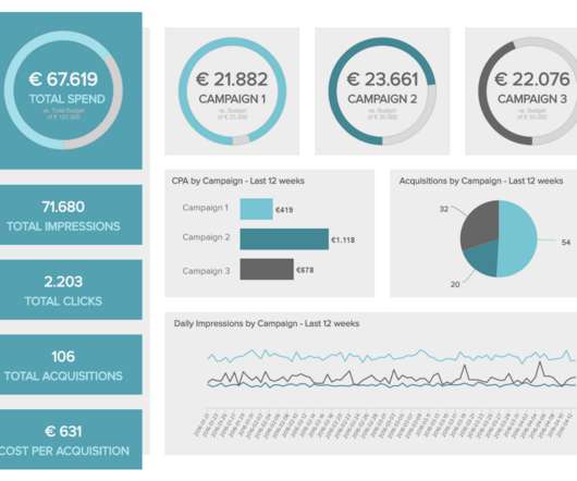
Typically presented in the form of an interactive dashboard , this kind of report provides a visual representation of the data associated with your predetermined set of key performance indicators – or KPI data, for short. How Do I Prepare A KPI Report? Now, let’s look at how to create a KPI report.

KPI 223
article thumbnail

What Is An Operational Report? A Complete Guide

FineReport

Operational reports have the potential to greatly enhance business performance through the utilization of data-driven insights. These reports offer a structured and comprehensible representation of data, enabling a clearer understanding of complex issues that might otherwise remain elusive.

Insiders

Sign Up for our Newsletter

This site is protected by reCAPTCHA and the Google Privacy Policy and Terms of Service apply.

Trending Sources

article thumbnail

What is Data Visualization: Complete Guide 2024

FineReport

Visual representations enable decision-makers at all levels to understand the implications of the data more clearly. This understanding empowers them to make well-informed choices based on a comprehensive comprehension of the presented information, ultimately leading to more effective strategies and outcomes.

article thumbnail

Take Advantage Of Operational Metrics & KPI Examples – A Comprehensive Guide

datapine

By setting operational performance measures, you will know what is happening at every stage of your business. They help in making the right decision: To ensure positive business results, data-enabled decisions are critical. Who will measure it? Keep in mind the differences and particularities of each location.

KPI 269
article thumbnail

Everything You Need to Know About Project Management Dashboard

FineReport

By visualizing risk data, project managers can proactively address potential issues, implement risk mitigation strategies, and minimize the impact of risks on project outcomes. Determine what key metrics, data, and insights you want to display to effectively monitor and manage your project.

article thumbnail

Move Beyond Excel, PowerPoint And Static Business Reporting with Powerful Interactive Dashboards

datapine

An interactive dashboard is a data management tool that tracks, analyzes, monitors, and visually displays key business metrics while allowing users to interact with data, enabling them to make well-informed, data-driven, and healthy business decisions.

article thumbnail

How to Choose the Best Analytics Platform, and Empower Business-Driven Analytics

Grooper

Read on to learn how data literacy, information as a second language, and insight-driven analytics take digital strategy to a new level. C-level executives and professionals alike must learn to speak a new language - data. Key Language of Applied Analytics. Master data management. Data governance.