Remove Document Remove Metrics Remove Slice and Dice Remove Visualization
article thumbnail

5 tips for excelling at self-service analytics

CIO Business Intelligence

Having that roadmap from the start helps to trim down and focus on the actual metrics to create. Have a data governance plan as well to validate and keep the metrics clean. As soon as one metric is not accurate it is hard to get the buy-in again, so routinely confirming accuracy on all analytics is extremely important.”

Analytics 133
article thumbnail

How Model Observability Provides a 360° View of Models in Production

DataRobot Blog

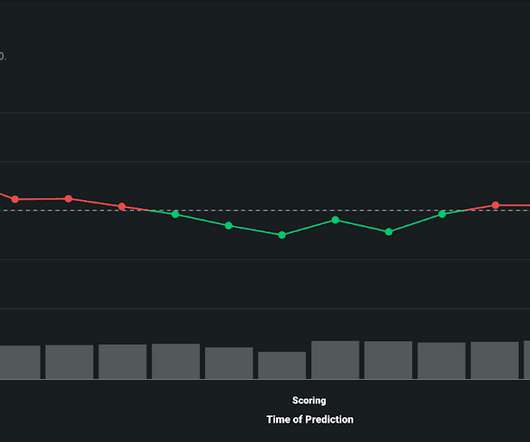
By tracking service, drift, prediction data, training data, and custom metrics, you can keep your models and predictions relevant in a fast-changing world. Model Observability compounds performance stats and metrics across the entire model lifecycle to provide context to problems that can threaten the integrity of your models.

Insiders

Sign Up for our Newsletter

This site is protected by reCAPTCHA and the Google Privacy Policy and Terms of Service apply.

article thumbnail

The How-To Guide for Cleaning and Preparing Data for Analysis

Juice Analytics

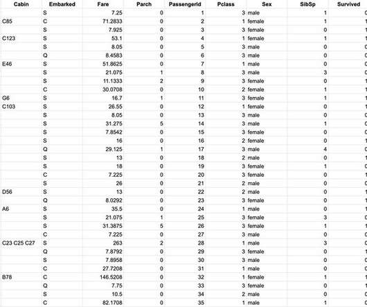
Add a sheet to document your changes. Change the data field names to give them a label that is around 5-15 characters — abbreviations can be confusing, long labels will be hard to show in your visualizations. The same metric is broken out into separate columns. Data for analysis is your raw materials, not the final canvas.

article thumbnail

Move Beyond Excel, PowerPoint And Static Business Reporting with Powerful Interactive Dashboards

datapine

Visualizing the data and interacting on a single screen is no longer a luxury but a business necessity. They enable you to easily visualize your data, filter on-demand, and slice and dice your data to dig deeper. Maps are important data visualizations and at datapine, we love utilizing them in our dashboards.

article thumbnail

Data Visualization Inspiration: Analysis To Insights To Action, Faster!

Occam's Razor

Like a vast majority on planet Earth, I love data visualizations. A day-to-day manifestation of this love is on my Google+ or Facebook profiles where 75% of my posts are related to my quick analysis and learnings from a visualization. Data visualized is data understood. Short story #4: Multi-dimensional Slicing and Dicing!

article thumbnail

What Is Embedded Analytics?

Jet Global

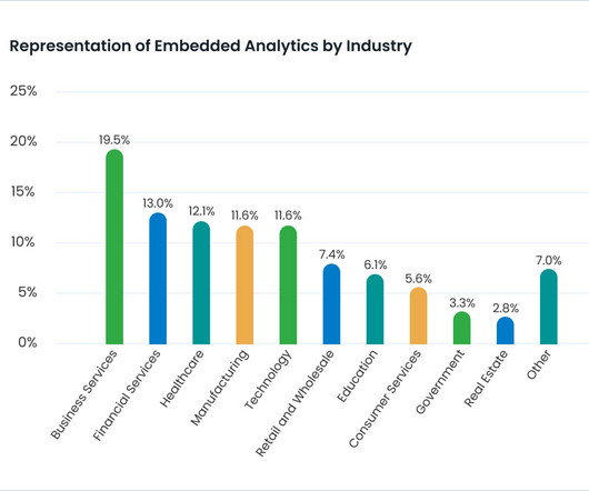
Plus, there is an expectation that tools be visually appealing to boot. In the past, data visualizations were a powerful way to differentiate a software application. Their dashboards were visually stunning. Today, free visualizations seem to be everywhere. Users’ varied needs require a shift in traditional BI thinking.