Remove Key Performance Indicator Remove Slice and Dice Remove Testing Remove Visualization
article thumbnail

Do I Need Both BI Tools and Augmented Analytics?

Smarten

Data Discovery including self-serve data preparation, smart data visualization with charts, graphs and other visualizations for clarity and decisions. Predictive Modeling to support business needs, forecast, and test theories. Key Performance Indicators (KPIs). Smart Data Visualization. Auto Insights.

article thumbnail

It's Not The Ink, It's The Think: 6 Effective Data Visualization Strategies

Occam's Razor

Too many bars, inside them too many slices, odd color choices, all end up with this question: what the heck's going on here? We throw off a lot of data as a subtle way of earning a great job performance review. What you want to do instead is to do all the slicing, dicing, segmentation, beautiful math, and then step above it.

Insiders

Sign Up for our Newsletter

This site is protected by reCAPTCHA and the Google Privacy Policy and Terms of Service apply.

article thumbnail

Move Beyond Excel, PowerPoint And Static Business Reporting with Powerful Interactive Dashboards

datapine

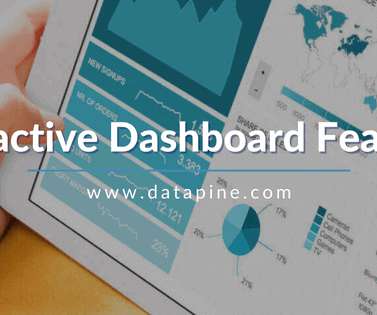
Visualizing the data and interacting on a single screen is no longer a luxury but a business necessity. In essence, in this post, we will explain all the details needed for dashboard reporting and creation, compare interactive vs. static reporting, and provide tips and tricks to make your business perform even better.

article thumbnail

12 Marketing Reports Examples You Can Use For Annual, Monthly, Weekly And Daily Reporting Practice

datapine

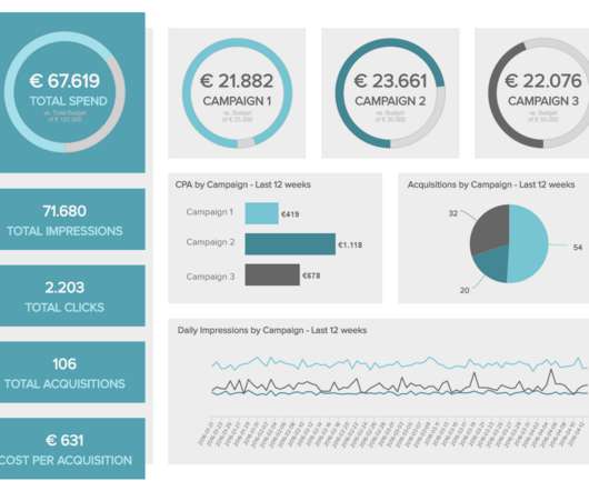
Using the right marketing KPIs (key performance indicators) is a good start – what is now left is finding a way to organize it all in a way that makes sense and brings value. These reports are slicing, dicing, and analyzing data, while connects the dots between your marketing activities and the goals originally set.

Reporting 280
article thumbnail

Empowering Analysis Ninjas? 12 Signs To Identify A Data Driven Culture

Occam's Razor

7: 25% of all analytical effort is dedicated to data visualization/enhancing data's communicative power. #6: While these metrics sound good, and yes they do get a bunch of press coverage (they have good PR Agents), they are rarely deeply relevant and even more rarely yield valuable insights into business performance.

article thumbnail

What Is Embedded Analytics?

Jet Global

Plus, there is an expectation that tools be visually appealing to boot. In the past, data visualizations were a powerful way to differentiate a software application. Their dashboards were visually stunning. Today, free visualizations seem to be everywhere. It’s all about context. End users expect more from analytics too.