Remove learn-how-to-make-great-graphs-in-excel-with-ann-k-emery
article thumbnail

Teaching + Knowledge = Passion for Data Viz

Depict Data Studio

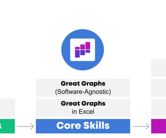
One of the primary reasons for taking Ann’s data visualization course, Great Graphs , was to learn better ways to use Microsoft Excel as a visualization tool. I am so excited to share how grateful I am to Ann and her colleagues for putting together an online training to share their talents with me.

article thumbnail

10+ Tips from an International Dataviz Speaker

Depict Data Studio

He is considered a leading voice for clarity and accessibility in how researchers communicate their findings. We’ve known each for nearly a decade already, and even tell the funny story of how we met in the podcast. We’ve known each for nearly a decade already, and even tell the funny story of how we met in the podcast.

Insiders

Sign Up for our Newsletter

This site is protected by reCAPTCHA and the Google Privacy Policy and Terms of Service apply.

article thumbnail

Learn How to Make Great Graphs in Excel with Ann K. Emery

Depict Data Studio

Bad graphs can slow down the viewer’s comprehension… increase cognitive load… and fail to inform decision-making processes. With intentional editing, you can design visualizations that inform and inspire–right inside of Excel, PowerPoint, and Word. What’s Included in Great Graphs: Excel How-To’s.

article thumbnail

How to Design Reports that Actually Inform Decisions

Depict Data Studio

More graphs. Here’s what’s included to make that happen. Here’s what’s included to make that happen. Here’s what’s included to make that happen. This training IS for people using everyday software like Excel, Word, and PowerPoint. Fewer paragraphs. Who This Training is For.

article thumbnail

My 6 Data Communications Classes

Depict Data Studio

One class focuses on data analysis (cleaning and tabulating our raw datasets to get them ready for graphs). You’ll need to have your graphs created and edited first (skills taught in previous classes) so they can feed into those reports, dashboards, and presentations. Not sure where to start? This workshop is highly interactive.