Remove Metrics Remove Statistics Remove Uncertainty Remove Visualization
article thumbnail

Take Advantage Of The Best Interactive & Effective Data Visualization Examples

datapine

Table of Contents 1) The Benefits Of Data Visualization 2) Our Top 27 Best Data Visualizations 3) Interactive Data Visualization: What’s In It For Me? 4) Static vs. Animated Data Visualization Data is the new oil? ” – David McCandless Humans are visual creatures. This very notion is the core of visualization.

article thumbnail

Towards optimal experimentation in online systems

The Unofficial Google Data Science Blog

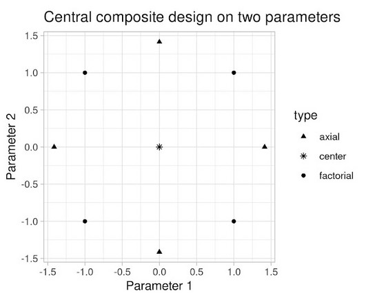
the weight given to Likes in our video recommendation algorithm) while $Y$ is a vector of outcome measures such as different metrics of user experience (e.g., Crucially, it takes into account the uncertainty inherent in our experiments. Here, $X$ is a vector of tuning parameters that control the system's operating characteristics (e.g.

Insiders

Sign Up for our Newsletter

This site is protected by reCAPTCHA and the Google Privacy Policy and Terms of Service apply.

Trending Sources

article thumbnail

Product Management for AI

Domino Data Lab

Ensure that product managers work on projects that matter to the business and/or are aligned to strategic company metrics. All you need to know, for now, is that machine learning is a field of artificial intelligence that uses statistical techniques to give computer systems the ability to learn based on data by being trained on past examples.

article thumbnail

How Microsoft is Reactivating its Workforce During The Pandemic

Timo Elliott

We’ve created a metric with our data scientists called P0, the progress to zero, and we talk in terms of the progress to zero in terms of case counts and deaths. It’s very visual and something somebody can grasp really quickly. Timo: I believe there’s been a massive explosion of interest in data.

IT 71
article thumbnail

Data Science, Past & Future

Domino Data Lab

He was saying this doesn’t belong just in statistics. He also really informed a lot of the early thinking about data visualization. It involved a lot of work with applied math, some depth in statistics and visualization, and also a lot of communication skills. You know, these are probabilistic systems.

article thumbnail

Data scientist as scientist

The Unofficial Google Data Science Blog

Note also that this account does not involve ambiguity due to statistical uncertainty. Another concern is that the Google results page sometimes contains visual elements, such as images, that may create sharp changes in user attention. To roughly control for this effect, we compared click patterns on devices of different height.