article thumbnail

Misleading Statistics Examples – Discover The Potential For Misuse of Statistics & Data In The Digital Age

datapine

For the presidential run of 2012, the news network showed the graph below where we see a pie chart displaying a total of 193% which is clearly wrong and misleading as the total should be 100%. In 2012, the global mean temperature was measured at 58.2 It demonstrates the change in air temperature (Celsius) from 1998 to 2012.


article thumbnail

Take Your SQL Skills To The Next Level With These Popular SQL Books

datapine

Some of these ‘structures’ may include putting all the information; for instance, a structure could be about cars, placing them into tables that consist of makes, models, year of manufacture, and color. With a MySQL dashboard builder , for example, you can connect all the data with a few clicks.

Insiders

Sign Up for our Newsletter

This site is protected by reCAPTCHA and the Google Privacy Policy and Terms of Service apply.

Trending Sources

article thumbnail

Convergent Evolution

Peter James Thomas

From 2000 to 2015, I had some success [5] with designing and implementing Data Warehouse architectures much like the following: As a lot of my work then was in Insurance or related fields, the Analytical Repositories tended to be Actuarial Databases and / or Exposure Management Databases, developed in collaboration with such teams.

article thumbnail

Towards optimal experimentation in online systems

The Unofficial Google Data Science Blog

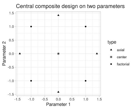
Experiments, Parameters and Models At Youtube, the relationships between system parameters and metrics often seem simple — straight-line models sometimes fit our data well. That is true generally, not just in these experiments — spreading measurements out is generally better, if the straight-line model is a priori correct.