Remove 2014 Remove KPI Remove Reporting Remove Visualization
article thumbnail

Upcoming Power BI Workshop in Huntington Beach, CA – Apr 10, 2015

Ms SQL Girl

Actionable Visualization In Power BI. Publishing and Administering Dashboards and Reports in Power BI for the Organisation. Attendees will learn the differences between the self-service capabilities offered as on-premise Vs cloud based, and why and when they are important for analytical, operational and strategic reports.

Insiders

Sign Up for our Newsletter

This site is protected by reCAPTCHA and the Google Privacy Policy and Terms of Service apply.

Trending Sources

article thumbnail

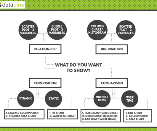
Designing Charts and Graphs: How to Choose the Right Data Visualization Types

datapine

Modern dashboard software makes it simpler than ever to merge and visualize data in a way that’s as inspiring as it is accessible. Knowing what story you want to tell (analyzing the data) tells you which data visualization type to use. Let’s assume you have the right data and the right data visualization software. Distribution.

article thumbnail

Benchmarking Performance: Your Options, Dos, Don'ts and To-Die-Fors!

Occam's Razor

Conversion rates reported by asking a group of companies what they are for their company, are hugely suspect. One more metric I love and adore highlighting to the senior leaders in companies is the KPI Page Value in Google Analytics. This creates a sample, sampling and self-reported biases. You can still learn from both.

article thumbnail

Discover 20 Essential Types Of Graphs And Charts And When To Use Them

datapine

That said, there is still a lack of charting literacy due to the wide range of visuals available to us and the misuse of statistics. In many cases, even the chart designers are not picking the right visuals to convey the information in the correct way. Let’s dive into them.

article thumbnail

Data Science at The New York Times

Domino Data Lab

When I showed up I was reporting to the head of BI who reported to CTO who reported to CIO who reported to EVP of digital products who reported to CEO. At this point data is a function that reports directly to CEO. It’s a visual problem so it works both in our MSE and it works by your eyeballs.