Remove 2017 Remove Metrics Remove Testing Remove Visualization
article thumbnail

Create Modern SQL Dashboards With Professional Tools & Software

datapine

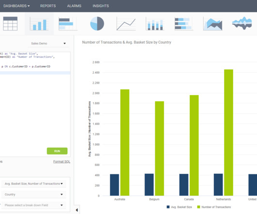
In some cases, you will need a coding solution where you can build your own queries, but in others, you will also look for a visual representation of your realational data. Your Chance: Want to test a SQL dashboard software completely for free? How To Create SQL Dashboards – Coding & Visuals. What Is A SQL Dashboard?

article thumbnail

Don’t Start from Scratch! Make One of these Dashboards Instead

Depict Data Studio

Grant Deliverables In this blog post , you’ll see how Josephine Engels did need to start from scratch — she was visualizing these metrics for her organization for the first time — and then made several dashboards to track grant deliverables. Adapt one of these dashboards instead.

Insiders

Sign Up for our Newsletter

This site is protected by reCAPTCHA and the Google Privacy Policy and Terms of Service apply.

Trending Sources

article thumbnail

Towards optimal experimentation in online systems

The Unofficial Google Data Science Blog

the weight given to Likes in our video recommendation algorithm) while $Y$ is a vector of outcome measures such as different metrics of user experience (e.g., Experiments, Parameters and Models At Youtube, the relationships between system parameters and metrics often seem simple — straight-line models sometimes fit our data well.

article thumbnail

Explaining black-box models using attribute importance, PDPs, and LIME

Domino Data Lab

Because of its architecture, intrinsically explainable ANNs can be optimised not just on its prediction performance, but also on its explainability metric. Skater provides a wide range of algorithms that can be used for visual interpretation (e.g. After forming the X and y variables, we split the data into training and test sets.

Modeling 139
article thumbnail

Themes and Conferences per Pacoid, Episode 9

Domino Data Lab

Finale Doshi-Velez, Been Kim (2017-02-28) ; see also the Domino blog article about TCAV. Adrian Weller (2017-07-29). “ On the other hand, as Lipton emphasized, while the tooling produces interesting visualizations, visualizations do not imply interpretation. ML model interpretability and data visualization.

article thumbnail

13 Essential Data Visualization Techniques, Concepts & Methods To Improve Your Business – Fast

datapine

“By visualizing information, we turn it into a landscape that you can explore with your eyes. 90% of the information transmitted to the brain is visual. Data visualization methods refer to the creation of graphical representations of information. That’s where data visualization comes in. A sort of information map.

article thumbnail

ML internals: Synthetic Minority Oversampling (SMOTE) Technique

Domino Data Lab

Working with highly imbalanced data can be problematic in several aspects: Distorted performance metrics — In a highly imbalanced dataset, say a binary dataset with a class ratio of 98:2, an algorithm that always predicts the majority class and completely ignores the minority class will still be 98% correct. return synthetic. Chawla et al.,