article thumbnail

Pandas Profiling – A Visual Analytics Wonder

Analytics Vidhya

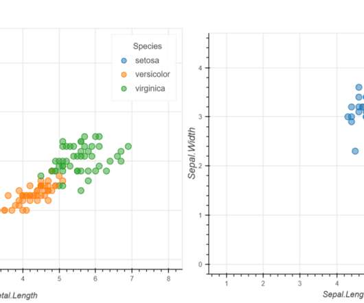
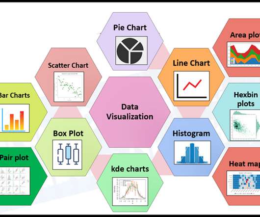
This article was published as a part of the Data Science Blogathon. Introduction Pandas’ Python profiling package produces an interactive set of tables and visualizations for exploratory data exploration (EDA). The post Pandas Profiling – A Visual Analytics Wonder appeared first on Analytics Vidhya.

article thumbnail

ggplot in Python: A Data Visualization Guide

Analytics Vidhya

Introduction In data analysis, creating visual representations is key to understanding and communicating insights effectively. This article will dive into ggplot’s features and why it’s such a valuable tool for visualizing data […] The post ggplot in Python: A Data Visualization Guide appeared first on Analytics Vidhya.

Insiders

Sign Up for our Newsletter

This site is protected by reCAPTCHA and the Google Privacy Policy and Terms of Service apply.

article thumbnail

Text Classification of News Articles

Analytics Vidhya

This article was published as a part of the Data Science Blogathon Introduction A news article discusses current or recent news of either general interest (i.e. A news article can include accounts of eyewitnesses to the happening event. […]. daily newspapers) or on a specific topic (i.e.

article thumbnail

Visualising Published Articles and Analysing them Using Plotly

Analytics Vidhya

This article was published as a part of the Data Science Blogathon. Thus the visualization maps are very important as they provide insight to data even for the non-technical person. I have used the plotly library for this article. A picture speaks thousands of words. To create a good chart there are many libraries present.

article thumbnail

Interactive Data Visualization using rbokeh

Analytics Vidhya

This article was published as a part of the Data Science Blogathon. Introduction Data Visualization is used to present the insights in a given dataset. The post Interactive Data Visualization using rbokeh appeared first on Analytics Vidhya.

article thumbnail

Data visualization for One-dimensional Data

Analytics Vidhya

This article was published as a part of the Data Science Blogathon. Introduction Data visualization is the skill that helps us to interpret the data in a creative and intrusive way. Suppose we break down more aspects of data visualization. In that case, we can see it is one of the best ways to draw […].

article thumbnail

How to Use Data Visualization in Infographics?

Analytics Vidhya

Data visualization in infographics is a dynamic way to do so. This article delves into data visualization within infographics and showcases ways to present information both aesthetically and comprehensively. What is Data Visualization? appeared first on Analytics Vidhya.