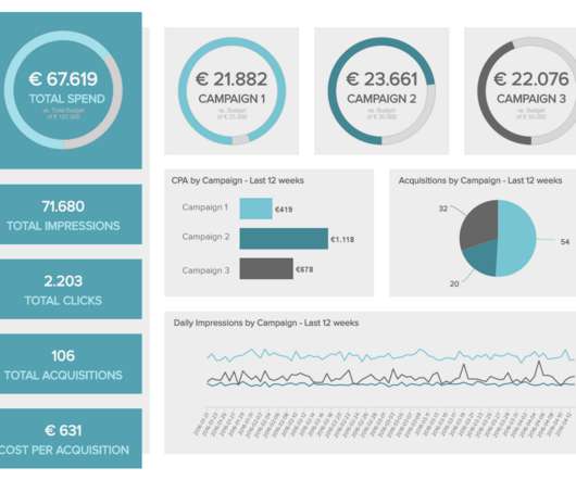
12 Marketing Reports Examples You Can Use For Annual, Monthly, Weekly And Daily Reporting Practice
datapine
FEBRUARY 4, 2020
While your keyboard is burning and your fingers try to keep up with your brain and comprehend all the data you’re writing about, using an interactive online data visualization tool to set specific time parameters or goals you’ve been tracking can bring a lot of saved time and, consequently, a lot of saved money. 1) Web Analytics Report.


Let's personalize your content