Remove Dashboards Remove Data Collection Remove Visualization Remove Workshop
article thumbnail

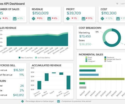
Digital Dashboard: Make You Prosper In Digital Era

FineReport

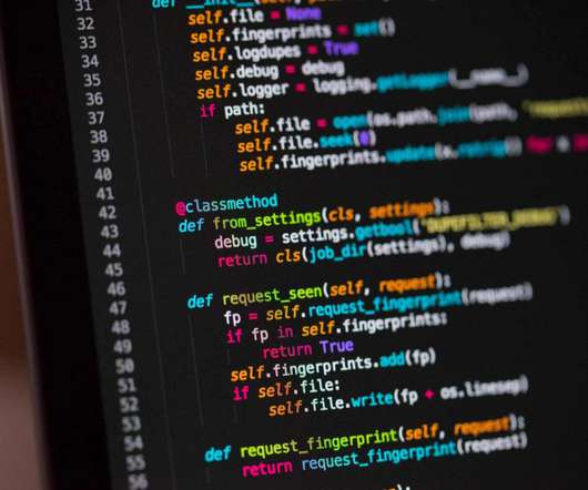
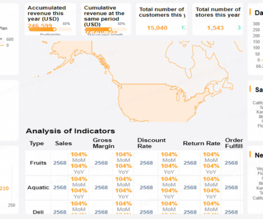
Are you still using the traditional cumbersome and redundant data collection methods? Have you ever neglected key indicators because of irrelevant data in your decision-making? No need to be worried anymore, all these management problems could be settled with digital dashboard. Digital dashboard software.

article thumbnail

Unlocking Growth Potential: A Guide to Effective KPI Tracking

FineReport

Additionally, we will provide real-life examples of KPI tracking dashboards and a step-by-step guide to setting up your own dashboard. By carefully selecting appropriate KPIs for different business areas, they can be utilized to organize and visualize extensive datasets. What Is KPI Tracking? Free Download of FineReport 1.

KPI 52
Insiders

Sign Up for our Newsletter

This site is protected by reCAPTCHA and the Google Privacy Policy and Terms of Service apply.

article thumbnail

Amazon OpenSearch Service H1 2023 in review

AWS Big Data

It uses Amazon Simple Storage Service (Amazon S3) as the primary data storage for indexes, adding durability for your data. Collections are able to take advantage of the S3 storage layer to reduce the need for hot storage, and reduce cost, by bringing data into local store when it’s accessed. in OpenSearch Service).

article thumbnail

Visualizing COVID-19 Data Responsibly: An Interview with Amanda Makulec

Depict Data Studio

In April, I sat down with Amanda Makulec, one of my longtime data and evaluation friends, to learn about visualizing COVID-19 responsibly. Amanda is the Data Visualization Capability Lead at Excella; a co-organizer for Dataviz DC; and the Operations Director for the Data Visualization Society (DVS).

article thumbnail

The Modern Data Stack Explained: What The Future Holds

Alation

Data would be pulled from various sources, organized into, say, a table, and loaded into a data warehouse for mass consumption. This was not only time-consuming, but the growing popularity of cloud data warehouses compelled people to rethink this process. 4) Start visualizing data using business intelligence tools.

article thumbnail

How to Design Reports that Actually Inform Decisions

Depict Data Studio

” aim for 1+ visual per page; add 15+ styles of visuals using my checklist; go beyond the bar chart; lower the reading grade level of your writing; and tell a story through dark-light contrast and takeaway text. The first 10 people to register will ALSO receive verbal feedback on their graph, report, dashboard, or infographic.

article thumbnail

My 6 Data Communications Classes

Depict Data Studio

Two classes focus on core data visualization skills (translating technical information for non-technical audiences; making sure we don’t just have bar charts; and using colors and fonts that are branded, accessible, and intuitive). I call them deep dives because they focus just on reports, or dashboards, or presentations.