Remove Dashboards Remove Data Warehouse Remove Interactive Remove Software
article thumbnail

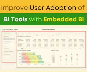
Top 5 Tools for Building an Interactive Analytics App

Smart Data Collective

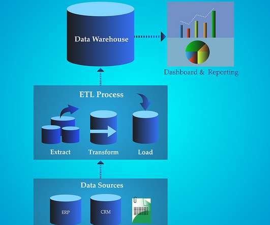
An interactive analytics application gives users the ability to run complex queries across complex data landscapes in real-time: thus, the basis of its appeal. Interactive analytics applications present vast volumes of unstructured data at scale to provide instant insights. Why Use an Interactive Analytics Application?

article thumbnail

Mastering BI Dashboard Tools: Your Essential Guide

FineReport

In today’s data-driven landscape, businesses are leaning more on BI tools , particularly BI dashboard solutions, to enhance decision-making through data visualization. These BI Dashboard tools blend advanced analytics with user-friendly interfaces, revealing invaluable insights.

Insiders

Sign Up for our Newsletter

This site is protected by reCAPTCHA and the Google Privacy Policy and Terms of Service apply.

article thumbnail

Business Intelligence Dashboard (BI Dashboard): Best Practices and Examples

FineReport

With the advent of Business Intelligence Dashboard (BI Dashboard), access to information is no longer limited to IT departments. Every user can now create interactive reports and utilize data visualization to disseminate knowledge to both internal and external stakeholders.

article thumbnail

Top Business Intelligence Features To Boost Your Business Performance

datapine

1) Benefits Of Business Intelligence Software. a) Data Connectors Features. c) Dashboard Features. For a few years now, Business Intelligence (BI) has helped companies to collect, analyze, monitor, and present their data in an efficient way to extract actionable insights that will ensure sustainable growth.

article thumbnail

Best 10 Dashboard Reporting Tools You Can’t Miss

FineReport

Dashboard reporting refers to putting the relevant business metrics and KPIs in one interface, presenting them visually, dynamic, and in real-time, in the dashboard formats. This article will review the best 10 dashboard tools covering different areas, including open source and free software. What Makes a Great Dashboard?

article thumbnail

Enhance monitoring and debugging for AWS Glue jobs using new job observability metrics, Part 3: Visualization and trend analysis using Amazon QuickSight

AWS Big Data

Grafana provides powerful customizable dashboards to view pipeline health. QuickSight makes it straightforward for business users to visualize data in interactive dashboards and reports. Sample AWS CDK template This post provides a sample AWS CDK template for a dashboard using AWS Glue observability metrics.

Metrics 105
article thumbnail

Use the Amazon Redshift Data API to interact with Amazon Redshift Serverless

AWS Big Data

Amazon Redshift is a fast, scalable, secure, and fully managed cloud data warehouse that makes it simple and cost-effective to analyze all your data using standard SQL and your existing ETL (extract, transform, and load), business intelligence (BI), and reporting tools. Building a serverless data processing workflow.