Remove Data Processing Remove Interactive Remove Software Remove Visualization
article thumbnail

Move Beyond Excel, PowerPoint And Static Business Reporting with Powerful Interactive Dashboards

datapine

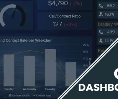
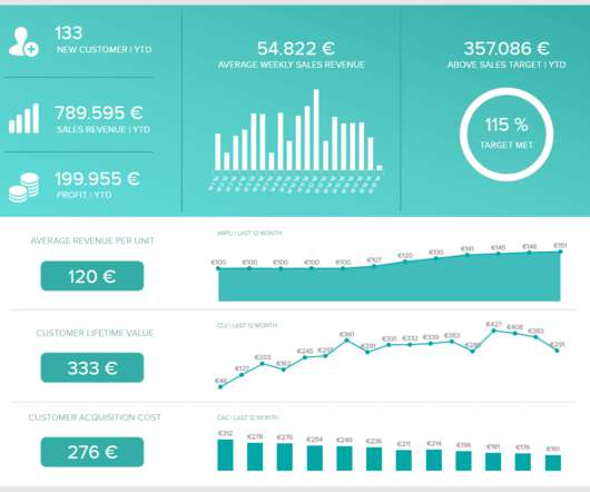
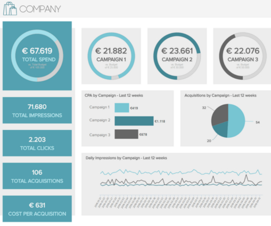
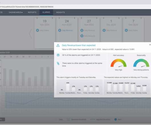
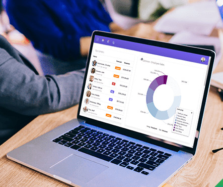
Soon businesses of all sizes will have so much amount of information that dashboard software will be the most invaluable resource a company can have. Visualizing the data and interacting on a single screen is no longer a luxury but a business necessity. That’s why we welcome you to the world of interactive dashboards.

article thumbnail

The Top 20 Data Visualization Books That Should Be On Your Bookshelf

datapine

Now that you’re sold on the power of data analytics in addition to data-driven BI, it’s time to take your journey a step further by exploring how to effectively communicate vital metrics and insights in a concise, inspiring, and accessible format through the power of visualization. They can be fun and interactive, too.

Insiders

Sign Up for our Newsletter

This site is protected by reCAPTCHA and the Google Privacy Policy and Terms of Service apply.

Trending Sources

article thumbnail

Enhance monitoring and debugging for AWS Glue jobs using new job observability metrics, Part 3: Visualization and trend analysis using Amazon QuickSight

AWS Big Data

QuickSight makes it straightforward for business users to visualize data in interactive dashboards and reports. QuickSight periodically runs Amazon Athena queries to load query results to SPICE and then visualize the latest metric data. Looking at the Skewness Job per Job visualization, there was spike on November 1, 2023.

Metrics 107
article thumbnail

What is data visualization? Presenting data for decision-making

CIO Business Intelligence

Data visualization definition. Data visualization is the presentation of data in a graphical format such as a plot, graph, or map to make it easier for decision makers to see and understand trends, outliers, and patterns in data. Maps and charts were among the earliest forms of data visualization.

article thumbnail

Monetizing Analytics Features: Why Data Visualizations Will Never Be Enough

Think your customers will pay more for data visualizations in your application? But today, dashboards and visualizations have become table stakes. Five years ago they may have. Discover which features will differentiate your application and maximize the ROI of your embedded analytics. Brought to you by Logi Analytics.

article thumbnail

Apply Modern CRM Dashboards & Reports Into Your Business – Examples & Templates

datapine

CRM software will help you do just that. Finally, we will show you a real-life example so you can get a visual overview and a clearer picture of the points discussed in this article. Try our professional dashboard software for 14 days, completely free! Try our professional dashboard software for 14 days, completely free!

article thumbnail

What Is Ad Hoc Reporting? Your Guide To Definition, Meaning, Examples & Benefits

datapine

Try our professional reporting software for 14 days, completely free! Moreover, a host of ad hoc analysis or reporting platforms boast integrated online data visualization tools to help enhance the data exploration process. This reduces the reliance on software developers or IT personnel for simple analysis and reporting.

Reporting 260