Remove Data Processing Remove KPI Remove Reference Remove Visualization
article thumbnail

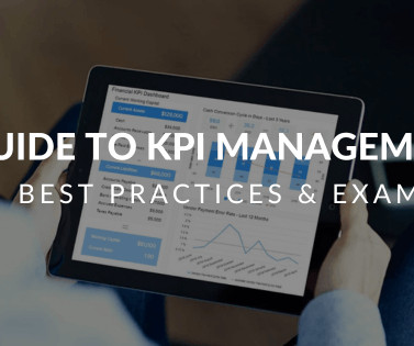
KPI Management And Best Practices: How To Find The Perfect KPI Solutions?

datapine

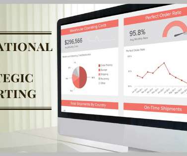
Table of Contents 1) What Is KPI Management? 2) Why Do KPIs Matter? 3) What Are KPI Best Practices? An even more interesting fact: The blogs we read regularly are not only influenced by KPI management but also concerning content, style, and flow; they’re often molded by the suggestions of these goal-driven metrics.

KPI 221
article thumbnail

Your Introduction To CFO Dashboards & Reports In The Digital Age

datapine

Serving as a central, interactive hub for a host of essential fiscal information, CFO dashboards host dynamic financial KPIs and intuitive analytical tools, as well as consolidate data in a way that is digestible and improves the decision-making process. We offer a 14-day free trial. What Is A CFO Dashboard?

Insiders

Sign Up for our Newsletter

This site is protected by reCAPTCHA and the Google Privacy Policy and Terms of Service apply.

Trending Sources

article thumbnail

A Guide to the Best Javascript Visualization Libraries

Sisense

JavaScript data visualization tools are in greater demand now than ever before because of the enormous growth of data. Marketing , finance , and sales teams all rely on visualizations to help them understand their data. Understanding Javascript data visualization libraries.

article thumbnail

Your Guide To Project Management Dashboards – Examples & Templates

datapine

By taking an online data visualization approach to handling your company’s strategic activities, big or small, you will make your business more cohesive, collaborative, intelligent and profitable – and project management dashboards will help you do just that. Armed with this knowledge, you can gain a significant edge on the competition.

article thumbnail

Move Beyond Excel, PowerPoint And Static Business Reporting with Powerful Interactive Dashboards

datapine

Visualizing the data and interacting on a single screen is no longer a luxury but a business necessity. They enable you to easily visualize your data, filter on-demand, and slice and dice your data to dig deeper. Maps are important data visualizations and at datapine, we love utilizing them in our dashboards.

article thumbnail

Getting Started With Strategic & Operational Reports

datapine

Here, we will consider the question ‘ What are operational reports,’ delve deeper into strategic reports, and examine a host of best operational reporting analysis practices. By gaining access to highly-visual interactive insights, you can: Make swift, informed decisions, often in real-time. Primary KPIs: On-Time Shipping.

article thumbnail

Discover 20 Essential Types Of Graphs And Charts And When To Use Them

datapine

That said, there is still a lack of charting literacy due to the wide range of visuals available to us and the misuse of statistics. In many cases, even the chart designers are not picking the right visuals to convey the information in the correct way. Let’s dive into them.