

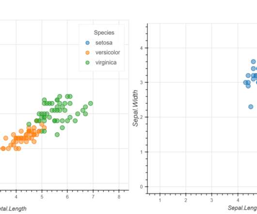
Creating Interactive and Animated Charts with ipyvizzu
Analytics Vidhya
MARCH 23, 2023
With the growing importance of data science and machine learning, data analysis holds a special place in […] The post Creating Interactive and Animated Charts with ipyvizzu appeared first on Analytics Vidhya.


Let's personalize your content