article thumbnail

Business Intelligence vs. Reporting: Finding Your Bread and Butter

Jet Global

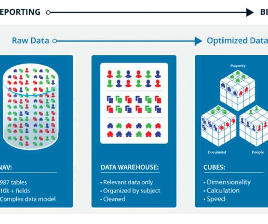
If you’re stumbling across this post through the sea of results researching “business intelligence vs. reporting,” then maybe you’re already familiar with the unlimited interpretations and definitions of these two practices. OLAP cubes do all the work by dimensionalizing all combinations of slicing and dicing the data ahead of time.

article thumbnail

The Complete Digital Analytics Ecosystem: How To Win Big

Occam's Razor

A very special type of metric is designated to be a Key Performance Indicator (KPI). Definition? You need to slice! You need to dice! Repeat after me: Slice, dice, drill!! Percentage that other thing. Helpful post: Best Metrics For Digital Marketing: Rock Your Own And Rent Strategies.].

Analytics 150
Insiders

Sign Up for our Newsletter

This site is protected by reCAPTCHA and the Google Privacy Policy and Terms of Service apply.

article thumbnail

Web Analytics 101: Definitions: Goals, Metrics, KPIs, Dimensions, Targets

Occam's Razor

"What is the difference between a metric and a key performance indicator (KPI)?" Definitions and standard perspectives on these terms will be covered in this post: Business Objectives. Key Performance Indicators. Key Performance Indicator: Key performance indicators (KPI's) are metrics.

Metrics 138
article thumbnail

Digital Dashboards: Strategic & Tactical: Best Practices, Tips, Examples

Occam's Razor

You need access to data, the ability to analyze (slice, dice, drill-up, drill-down, drill-around) interesting data points that your performance throws up, ability to understand what caused the performance (often by understanding who did, what and where in other parts of the organization), and the power to make decisions.

article thumbnail

12 Marketing Reports Examples You Can Use For Annual, Monthly, Weekly And Daily Reporting Practice

datapine

Using the right marketing KPIs (key performance indicators) is a good start – what is now left is finding a way to organize it all in a way that makes sense and brings value. But first, we will start with a basic definition and some tips on creating these kinds of reports. How do you know that? Let’s dig deeper.

Reporting 280
article thumbnail

Move Beyond Excel, PowerPoint And Static Business Reporting with Powerful Interactive Dashboards

datapine

They enable you to easily visualize your data, filter on-demand, and slice and dice your data to dig deeper. Let’s say one of your dashboards contains a high-level key performance indicators (KPI) tab that provides snapshots of all your departments.

article thumbnail

Great Storytelling With Data: Visualize Simply And Focus Obsessively

Occam's Razor

The design and layout are quite simple, definite kudos to the Analyst for that. To come up with the so what for the above user behavior, two posts for you: Multi-Channel Attribution Modeling: The Good, Bad and Ugly Models and Multi-Channel Attribution: Definitions, Models and a Reality Check.]. #6. Take a look at this slide.