Remove Metrics Remove Reference Remove Scorecard Remove Visualization
article thumbnail

Visualize data quality scores and metrics generated by AWS Glue Data Quality

AWS Big Data

It’s important for business users to be able to see quality scores and metrics to make confident business decisions and debug data quality issues. An operational scorecard is a mechanism used to evaluate and measure the quality of data processed and validated by AWS Glue Data Quality rulesets. An AWS Glue crawler crawls the results.


article thumbnail

A Beginner’s Guide To Inventory Metrics And Best Practices

datapine

At the same time, inventory metrics are needed to help managers and professionals in reaching established goals, optimizing processes, and increasing business value. Collecting big amounts of data is not the only thing to do; knowing how to process, analyze, and visualize the insights you gain from it is key.

Metrics 286
Insiders

Sign Up for our Newsletter

This site is protected by reCAPTCHA and the Google Privacy Policy and Terms of Service apply.

article thumbnail

A Guide To The Top 14 Types Of Reports With Examples Of When To Use Them

datapine

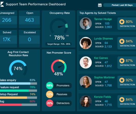
Let’s see it more in detail with a visual example. This insightful report displays relevant metrics such as the top-performing agents, net promoter score, and first contact resolution rate, among others. Progress reports are often used as visual materials to support meetings and discussions. A good example is a KPI scorecard.

Reporting 201
article thumbnail

13 power tips for Microsoft Power BI

CIO Business Intelligence

Power BI is Microsoft’s interactive data visualization and analytics tool for business intelligence (BI). With Power BI, you can pull data from almost any data source and create dashboards that track the metrics you care about the most. What-if parameters also create calculated measures you can reference elsewhere.

article thumbnail

Google Analytics Tips: 10 Data Analysis Strategies That Pay Off Big!

Occam's Razor

Prioritize using a mix of bounce and page value, analyze details using referring keywords and referring urls (drilldowns are already built into above custom report!). This post is about standard GA reports, but the standard cart/checkout funnel visualization in GA is value deficient. Look at all others. Goals Report. Very handy.

Strategy 159
article thumbnail

Google Analytics Tutorial: 8 Valuable Tips To Hustle With Data!

Occam's Razor

Produce built-in visualization magic. You pick the period for comparison, your the necessary dimension and metric, add the condition, type a value and you're in business. My preferred path is to leverage the tool's built-in features for filtering/visualizing the data. I mean really use the tools. Not today.

Analytics 145
article thumbnail

Be Real-World Smart: A Beginner's Advanced Google Analytics Guide

Occam's Razor

Along the way I'll share some of my favourite metrics and analytics best practices that should accelerate your path to becoming a true Analysis Ninja. At this point you'll be a little confused about some metric or the other. Go, read one of the best pages in the Analytics help center: Understanding Dimensions and Metrics.

Analytics 109