Remove 2007 Remove Statistics Remove Testing Remove Visualization
article thumbnail

Towards optimal experimentation in online systems

The Unofficial Google Data Science Blog

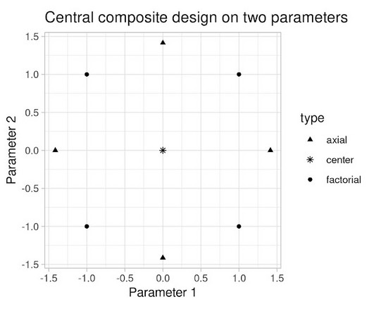
If $Y$ at that point is (statistically and practically) significantly better than our current operating point, and that point is deemed acceptable, we update the system parameters to this better value. Figure 4: Visualization of a central composite design. And we can keep repeating this approach, relying on intuition and luck.

article thumbnail

Time Series with R

Domino Data Lab

A big part of statistics, particularly for financial and econometric data, is analyzing time series, data that are autocorrelated over time. class(attClose) [1] "xts" "zoo" > head(attClose) T.Close 2007-01-03 34.95 2007-01-04 34.50 2007-01-05 33.96 2007-01-08 33.81 2007-01-09 33.94 2007-01-10 34.03.

Insiders

Sign Up for our Newsletter

This site is protected by reCAPTCHA and the Google Privacy Policy and Terms of Service apply.

article thumbnail

Knowledge

Occam's Razor

Six Data Visualizations That Rock! The Awesome Power of Visualization 2 -> Death and Taxes 2007. The Awesome Power of Data Visualization. Five Reasons And Awesome Testing Ideas. Lab Usability Testing: What, Why, How Much. Build A Great Web Experimentation & Testing Program. Got Surveys?

KPI 124
article thumbnail

Misleading Statistics Examples – Discover The Potential For Misuse of Statistics & Data In The Digital Age

datapine

1) What Is A Misleading Statistic? 2) Are Statistics Reliable? 3) Misleading Statistics Examples In Real Life. 4) How Can Statistics Be Misleading. 5) How To Avoid & Identify The Misuse Of Statistics? If all this is true, what is the problem with statistics? What Is A Misleading Statistic?