Remove 2012 Remove Big Data Remove Measurement Remove Visualization
article thumbnail

Measure performance of AWS Glue Data Quality for ETL pipelines

AWS Big Data

In this post, we provide benchmark results of running increasingly complex data quality rulesets over a predefined test dataset. On the AWS Glue console, under ETL jobs in the navigation pane, choose Visual ETL. In the Create job section, choose Visual ETL.x Select the ETL job and choose Run job. Repeat for all the ETL jobs.

article thumbnail

A Guide To The Methods, Benefits & Problems of The Interpretation of Data

datapine

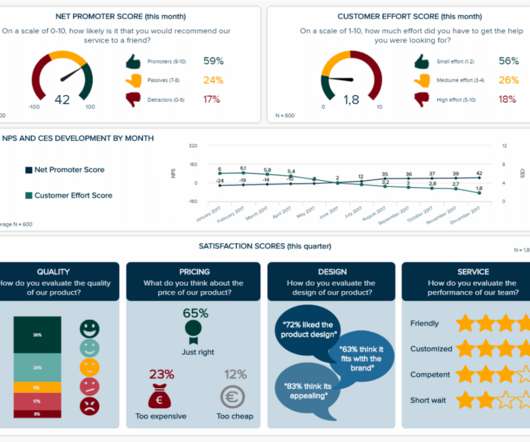
In fact, a Digital Universe study found that the total data supply in 2012 was 2.8 Based on that amount of data alone, it is clear the calling card of any successful enterprise in today’s global world will be the ability to analyze complex data, produce actionable insights and adapt to new market needs… all at the speed of thought.

Insiders

Sign Up for our Newsletter

This site is protected by reCAPTCHA and the Google Privacy Policy and Terms of Service apply.

Trending Sources

article thumbnail

Perform time series forecasting using Amazon Redshift ML and Amazon Forecast

AWS Big Data

to create forecast tables and visualize the data. To show this capability, we demonstrate two use cases: Forecast electricity consumption by customer Predict bike sharing rentals What is time series data? Time series data is any dataset that collects information at various time intervals.

article thumbnail

Amazon DataZone now integrates with AWS Glue Data Quality and external data quality solutions

AWS Big Data

In the first part of this post, we walk through the integration between AWS Glue Data Quality and Amazon DataZone. We discuss how to visualize data quality scores in Amazon DataZone, enable AWS Glue Data Quality when creating a new Amazon DataZone data source, and enable data quality for an existing data asset.

article thumbnail

Run Spark SQL on Amazon Athena Spark

AWS Big Data

Then to perform more complex data analysis such as regression tests and time series forecasting, you can use Apache Spark with Python, which allows you to take advantage of a rich ecosystem of libraries, including data visualization in Matplot, Seaborn, and Plotly.

Data Lake 101
article thumbnail

How Can Beginners Create a Great Dashboard?

FineReport

In the current trend of big data, data visualization has become an interactive display mode that everyone admires. The picture below shows the characteristics of the excellent dashboard that Stephen Few listed in the Dashboard Graphic Design Competition in 2012. Prepare a data visualization tool.

article thumbnail

Themes and Conferences per Pacoid, Episode 8

Domino Data Lab

It includes perspectives about current issues, themes, vendors, and products for data governance. My interest in data governance (DG) began with the recent industry surveys by O’Reilly Media about enterprise adoption of “ABC” (AI, Big Data, Cloud). Data is on the move. We keep feeding the monster data.