Remove 2017 Remove Interactive Remove Measurement Remove Visualization
article thumbnail

Make Your Investment in Analytic Technology Pay Off With Decision Requirements Modeling

Decision Management Solutions

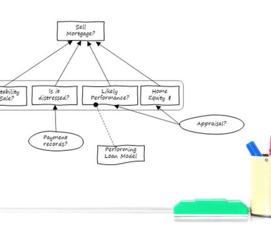
Like many enterprises, you’ve likely made a hefty investment in analytic technology—from interactive dashboards and advanced visualization tools to data mining, predictive analytics, machine learning (ML), and artificial intelligence (AI). 1 MIT Sloan Management Review September 06, 2017. We can show you how to accomplish this.

article thumbnail

10 Big Data Examples Showing The Great Value of Smart Analytics In Real Life At Restaurants, Bars, and Casinos

datapine

In 2017 the company wanted to take its shopping experience one step further by creating an augmented reality app that allowed users to test a product without having to leave their homes. It does this by using Artwork Visual Analysis (AVA) “a collection of tools and algorithms designed to surface high-quality imagery from videos.

Big Data 244
Insiders

Sign Up for our Newsletter

This site is protected by reCAPTCHA and the Google Privacy Policy and Terms of Service apply.

article thumbnail

13 Essential Data Visualization Techniques, Concepts & Methods To Improve Your Business – Fast

datapine

“By visualizing information, we turn it into a landscape that you can explore with your eyes. 90% of the information transmitted to the brain is visual. Data visualization methods refer to the creation of graphical representations of information. That’s where data visualization comes in. A sort of information map.

article thumbnail

Perform time series forecasting using Amazon Redshift ML and Amazon Forecast

AWS Big Data

to create forecast tables and visualize the data. Time series data is plottable on a line graph and such time series graphs are valuable tools for visualizing the data. The data contains measurements of electric power consumption in different households for the year 2014. In our case, we use Amazon Redshift Query Editor v2.0

article thumbnail

Towards optimal experimentation in online systems

The Unofficial Google Data Science Blog

the weight given to Likes in our video recommendation algorithm) while $Y$ is a vector of outcome measures such as different metrics of user experience (e.g., Taking measurements at parameter settings further from control parameter settings leads to a lower variance estimate of the slope of the line relating the metric to the parameter.

article thumbnail

Themes and Conferences per Pacoid, Episode 9

Domino Data Lab

Finale Doshi-Velez, Been Kim (2017-02-28) ; see also the Domino blog article about TCAV. Adrian Weller (2017-07-29). “ On the other hand, as Lipton emphasized, while the tooling produces interesting visualizations, visualizations do not imply interpretation. ML model interpretability and data visualization.

article thumbnail

Themes and Conferences per Pacoid, Episode 8

Domino Data Lab

Network security mushrooms with VPNs, IDS , gateways, various bump-in-the-wire solutions, SIMS tying all the anti-intrusion measures within the perimeter together, and so on. See also the paper “ The Case for Open Metadata ” by Mandy Chessell (2017–04–21) at IBM UK for compelling perspectives about open metadata. credit cards).