Remove 2019 Remove KPI Remove Reporting Remove Visualization
article thumbnail

Effective Report Design: a step-by-step guide

FineReport

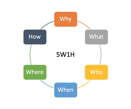
The design of reports can be considered from two aspects: layout and system. You may have seen many articles emphasize how to improve the layout of the report. Today, let’s learn the report designing from the perspective of the report system. The Basics of Report Designing . The Basics of Report Designing .

article thumbnail

Top 10 Types of Report: Examples and How to Design

FineReport

Reports are the basic business requirements of an enterprise. It can help enterprises make better use of data if different data can be presented by appropriate reports. Top 10 Types of Report. Detail Report. Top 10 Types of Report. Detail Report. The detail report is the simplest way to display the data.

Insiders

Sign Up for our Newsletter

This site is protected by reCAPTCHA and the Google Privacy Policy and Terms of Service apply.

article thumbnail

Create Modern SQL Dashboards With Professional Tools & Software

datapine

In some cases, you will need a coding solution where you can build your own queries, but in others, you will also look for a visual representation of your realational data. How To Create SQL Dashboards – Coding & Visuals. The good news is that you can utilize both with the help of a modern and professional SQL dashboard.

article thumbnail

Top 10 Analytics And Business Intelligence Trends For 2020

datapine

Spreadsheets finally took a backseat to actionable and insightful data visualizations and interactive business dashboards. 2019 was a particularly major year for the business intelligence industry. Companies are no longer wondering if data visualizations improve analyses but what is the best way to tell each data-story.

article thumbnail

Discover 20 Essential Types Of Graphs And Charts And When To Use Them

datapine

That said, there is still a lack of charting literacy due to the wide range of visuals available to us and the misuse of statistics. In many cases, even the chart designers are not picking the right visuals to convey the information in the correct way. Let’s dive into them.

article thumbnail

Top 10 Free and Open Source BI Tools in 2020

FineReport

Although compared to the paid version, not all free BI tool provides stunning data visualization; they offer easy-to-understand charts that can meet your basic needs. The most distinct is its reporting capabilities. Users can input the data back to the database via the web reports created by FineReport. . Dynamic reports.

OLAP 105
article thumbnail

AWS Professional Services scales by improving performance and democratizing data with Amazon QuickSight

AWS Big Data

Our team was formed in 2019 as an informal group of four analysts who supported ad hoc analysis for a division of ProServe consultants. We’ve made a big impact with QuickSight because it doesn’t require in-depth knowledge about data visualizations to build dashboards and provide insights, empowering our users to build what they need.