Remove Advertising Remove Key Performance Indicator Remove Slice and Dice Remove Visualization
article thumbnail

It's Not The Ink, It's The Think: 6 Effective Data Visualization Strategies

Occam's Razor

Too many bars, inside them too many slices, odd color choices, all end up with this question: what the heck's going on here? We throw off a lot of data as a subtle way of earning a great job performance review. What you want to do instead is to do all the slicing, dicing, segmentation, beautiful math, and then step above it.

article thumbnail

Great Storytelling With Data: Visualize Simply And Focus Obsessively

Occam's Razor

Avoid complex visualizations – they get in the way! Make performance comparisons easier! My goal is that you'll learn a set of filters you'll use as you think about the best ways to create your stories, however you choose to tell them with whatever visual output you most love. A delightful mess. Teddy ready?

Insiders

Sign Up for our Newsletter

This site is protected by reCAPTCHA and the Google Privacy Policy and Terms of Service apply.

Trending Sources

article thumbnail

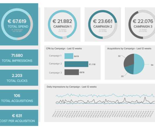
12 Marketing Reports Examples You Can Use For Annual, Monthly, Weekly And Daily Reporting Practice

datapine

Using the right marketing KPIs (key performance indicators) is a good start – what is now left is finding a way to organize it all in a way that makes sense and brings value. It shows how targets are performing in a monthly view, but the user can easily set this marketing dashboard to a yearly time frame.

Reporting 280
article thumbnail

Digital Dashboards: Strategic & Tactical: Best Practices, Tips, Examples

Occam's Razor

Allow me to visualize the problem above, and leverage that visualization to present the solution. As you might have guessed, you are at the very right of the above visual, with most access to data, the ability to analyze it ( inshallah! ) The VPs of Marketing, Advertising, Product, Public Relations, Human Resources etc.,