Remove Business Analysis Remove Metrics Remove Optimization Remove Visualization
article thumbnail

How can CIOs Build Business Value with Business Analytics?

Smart Data Collective

Team Upskilling: Train business analysts on planning, gap analysis, scoping & blueprinting, cost-benefit calculation of new initiatives, solution architecture, modelling, elicitation, requirement management, performance management, and other improvement initiatives. Tools Updating: A business analyst is as good as his/her tools.

article thumbnail

Great Storytelling With Data: Visualize Simply And Focus Obsessively

Occam's Razor

The Directors, the Marketers, the Optimization employees and our resident social media gurus. You can cut yourself with it and embarrass yourself, or you can look the very best you ever have by using it optimally. Avoid complex visualizations – they get in the way! Avoid complex visualizations – they get in the way!

Insiders

Sign Up for our Newsletter

This site is protected by reCAPTCHA and the Google Privacy Policy and Terms of Service apply.

Trending Sources

article thumbnail

Financial Dashboard: Definition, Examples, and How-tos

FineReport

A financial dashboard, one of the most important types of data dashboards , functions as a business intelligence tool that enables finance and accounting teams to visually represent, monitor, and present financial key performance indicators (KPIs). It is generally advisable to maintain a quick ratio above 100%.

article thumbnail

Social Media Analytics: Twitter: Quantitative & Qualitative Metrics

Occam's Razor

Stale marketing or measurement thinking applied to them results in terribly sub optimal results for all involved. In this post four twitter analysis tools that while not yet fully developed show sweet signs of: 1. Are not just reporting "hits", rather coming up with clever metrics. Quantitative Metrics / Analyses.

Metrics 124
article thumbnail

10 Best Dashboard Design Tips, Templates & How-To’s

FineReport

In this data-driven era, data visualization is indispensable in business operations. The most predominant means to visualize data is the application of various dashboards. Instead, the visual display of historical information is more important. Only Display Necessary Dashboard Metric s. Dashboard Design Tips.

article thumbnail

Human-centered design and data-driven insights elevate precision in government IT modernization

IBM Big Data Hub

This strategy is not based on a “gut feel” or anecdotal knowledge of a few individuals, but on a well-documented, expansive set of findings, business analysis and calculated projections. The pain point tracker clusters the foundational data in which value metrics are then applied. frequency (how many occurrences?),

article thumbnail

Best practices to implement near-real-time analytics using Amazon Redshift Streaming Ingestion with Amazon MSK

AWS Big Data

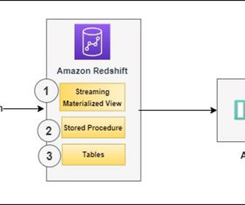
Establish connectivity between an Amazon QuickSight dashboard and Amazon Redshift to deliver visualization and insights. Make sure that data is flowing into your MSK topic using Amazon CloudWatch metrics (for example, BytesOutPerSec ). For instructions, refer to the Setting up IAM and performing streaming ingestion from Kafka.