article thumbnail

Chart Snapshot: Beanplots

The Data Visualisation Catalogue

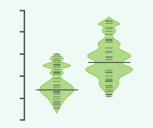
Additionally, the estimated density of the distribution is displayed behind, providing information about the concentration of values across the range. Beanplot: A Boxplot Alternative for Visual Comparison of Distributions, Peter Kampstra Figure 4: An asymmetric beanplot of the singers. Long, bold lines correspond to mean of each group.

article thumbnail

Smarten Announces SnapShot Anomaly Monitoring Alerts: Powerful Tools for Business Users!

Smarten

Smarten announces the launch of SnapShot Anomaly Monitoring Alerts for Smarten Augmented Analytics. SnapShot Monitoring provides powerful data analytical features that reveal trends and anomalies and allow the enterprise to map targets and adapt to changing markets with clear, prescribed actions for continuous improvement.

Insiders

Sign Up for our Newsletter

This site is protected by reCAPTCHA and the Google Privacy Policy and Terms of Service apply.

article thumbnail

Your Introduction To CFO Dashboards & Reports In The Digital Age

datapine

Serving as a central, interactive hub for a host of essential fiscal information, CFO dashboards host dynamic financial KPIs and intuitive analytical tools, as well as consolidate data in a way that is digestible and improves the decision-making process. What Is A CFO Report?

article thumbnail

Your Definitive Guide To Building Valuable Narratives Through Data Storytelling

datapine

Stories inspire, engage, and have the unique ability to transform statistical information into a compelling narrative that can significantly enhance business success. Beyond this data storytelling definition, the power of a data story lies in our natural affinity for plotlines and narratives that convey information.

KPI 193
article thumbnail

Your Definitive Guide To KPI Tracking By Utilizing Modern Software & Tools

datapine

Without data, you will only ever be ‘shooting in the dark’ when it comes to formulating strategies and making informed decisions. By selecting the right KPIs for various areas of the business, it’s possible to use them to arrange as well as visualize large datasets. To track KPIs is to gain greater business intelligence.

KPI 195
article thumbnail

Take Advantage Of The Top 16 Sales Graphs And Charts To Boost Your Business

datapine

This gives to that sales graph an overall sense of visual contrast which makes it much more digestible at a glance. Number 6 on our list is a sales graph example that offers a detailed snapshot of sales conversion rates. click to enlarge**. Note the mix of charts that show trends over time and standard numbers. 6) Sales Conversion.

Sales 235
article thumbnail

What's in a Juicebox: Connected Visuals

Juice Analytics

A slice is a Juice term for a data visualization within a section of Juicebox application. Part of that movement from top to bottom in Juicebox means that as the user is making selections within the application, those selections should not only carry down the page but that they should also inform the visuals that follow.