Remove Interactive Remove KPI Remove Statistics Remove Visualization
article thumbnail

Your Ultimate Guide To Modern KPI Reports In The Digital Age – Examples & Templates

datapine

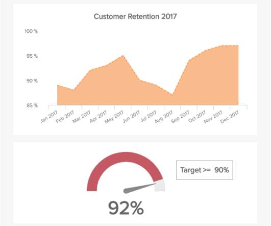
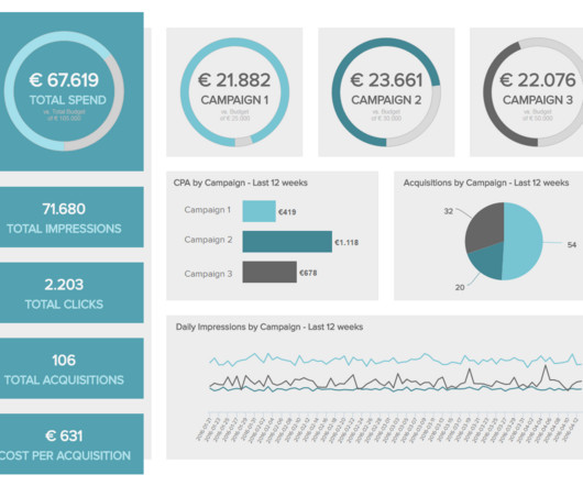
One of the most effective means of doing this is by utilizing KPI reporting tools. Exclusive Bonus Content: Understanding KPIs & reports – A summary! Let’s start by considering what KPIs are and what they mean in a business context. What Is A KPI? What Is A KPI Report? Why Are KPI Reports Important?

KPI 223
article thumbnail

Unveiling the Path to Success as a Data Visualization Specialist

FineReport

In today’s data-driven world, the data visualization specialist plays a pivotal role in transforming complex information into visually appealing formats. As companies seek to leverage data visualization expertise, individuals with the ability to present data in innovative ways are highly sought after.

Insiders

Sign Up for our Newsletter

This site is protected by reCAPTCHA and the Google Privacy Policy and Terms of Service apply.

Trending Sources

article thumbnail

Master Data Visualization Techniques: A Comprehensive Guide

FineReport

Data visualization techniques are paramount in today’s data-driven world. Mastering data visualization techniques is not just a skill but a necessity for professionals across various industries. Definition and Importance Visualizing data involves representing information through graphical elements like charts and graphs.

article thumbnail

What is Data Visualization: Complete Guide 2024

FineReport

What is Data Visualization Understanding the Concept Data visualization, in simple terms, refers to the presentation of data in a visual format. By utilizing visual elements, data visualization allows individuals to grasp difficult concepts or identify new patterns within the data.

article thumbnail

A Complete Guide To Bar Charts With Examples, Benefits, And Different Types 

datapine

2) Pros & Cons Of Bar Charts 3) When To Use A Bar Graph 4) Types Of Bar Charts 5) Bar Graphs & Charts Best Practices 6) Bar Chart Examples In today’s fast-paced analytical landscape, data visualization has become one of the most powerful tools organizations can benefit from to be successful with their analytical efforts.

article thumbnail

Dashboard Metrics: Your KPI Guidelines and Practices

FineReport

These KPI metrics are critical data to analyze and evaluate a company’s sales, human resources, and marketing, and operational activities. KPI Dashboard (From FineReport?. For example, track the efficacy of particular sales efforts using a measure or KPI (Key Performance Indicator). Dashboard metrics from FineReport.

KPI 52
article thumbnail

A Complete Guide To The Power Of Line Graphs With Examples On When To Use Them

datapine

That is because visuals make it easier to convey and understand critical information, breaching the knowledge gap between audiences across industries. That being said, for data visualizations to be successful and avoid misleading your audience, it is necessary to understand the different use cases for each visual.