article thumbnail

Box Plot in Python using Seaborn: A Comprehensive Guide

Analytics Vidhya

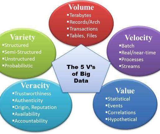
Introduction In data analysis, the ability to visually represent complex datasets is invaluable. Python, with its rich ecosystem of libraries, stands at the forefront of data visualization, offering tools that range from simple plots to advanced interactive diagrams.

article thumbnail

A Guide To Starting A Career In Business Intelligence & The BI Skills You Need

datapine

For example, if you enjoy computer science, programming, and data but are too extroverted to program all day long, you could work in a more human-oriented area of intelligence for business, perhaps involving more face-to-face interactions than most programmers would encounter on the job.

Insiders

Sign Up for our Newsletter

This site is protected by reCAPTCHA and the Google Privacy Policy and Terms of Service apply.

article thumbnail

A Complete Guide To Bar Charts With Examples, Benefits, And Different Types 

datapine

2) Pros & Cons Of Bar Charts 3) When To Use A Bar Graph 4) Types Of Bar Charts 5) Bar Graphs & Charts Best Practices 6) Bar Chart Examples In today’s fast-paced analytical landscape, data visualization has become one of the most powerful tools organizations can benefit from to be successful with their analytical efforts.

article thumbnail

Augmented Analytics Must Provide Data Quality and Insight!

Smarten

What you need are apps and solutions that allow you to ask easy questions in your own words and receive guidance and recommendations on how to best visualize and present your data and what techniques to use to gain the most insight. These measures empower them with a deeper understanding of their data like never before.

article thumbnail

Visualize data quality scores and metrics generated by AWS Glue Data Quality

AWS Big Data

In this post, we highlight the seamless integration of Amazon Athena and Amazon QuickSight , which enables the visualization of operational metrics for AWS Glue Data Quality rule evaluation in an efficient and effective manner. We can query and submit the Athena data to QuickSight to create visuals for the dashboard.

article thumbnail

Data Visualization Is Not a Panacea

Perceptual Edge

It galls me when people oversell data visualization. Data visualization combines technologies (visual representations of quantitative data) with specific skills (techniques for creating and interacting with those visual representations) to make sense of and communicate quantitative data.

article thumbnail

What are decision support systems? Sifting data for better business decisions

CIO Business Intelligence

Decision support systems definition A decision support system (DSS) is an interactive information system that analyzes large volumes of data for informing business decisions. Commonly used models include: Statistical models. Dashboards and other user interfaces that allow users to interact with and view results.