

It's Not The Ink, It's The Think: 6 Effective Data Visualization Strategies
Occam's Razor
JANUARY 31, 2017
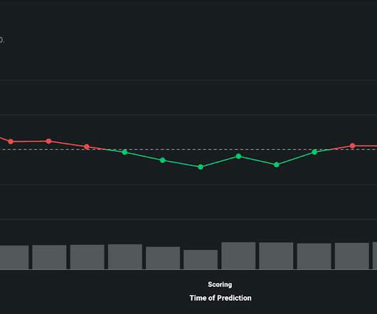
Too many bars, inside them too many slices, odd color choices, all end up with this question: what the heck's going on here? There is only one simple message above, and just two metrics that matter. It also forces a lot less think than might be optimal. Everything seems sub-optimal. Interesting trend.


Let's personalize your content