
Better Know a Visualization: Scatterplot
Juice Analytics
MARCH 2, 2021
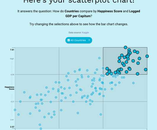
In 2010, I wrote: With enough visualization methods to warrant a periodic table , it can be confusing to know what to use and when—and which visualizations are even worth considering at all. people, places, user segments) compare to each other when plotted by two measures. A scatterplot chart shows how a bunch of items (e.g.


Let's personalize your content