Remove 2013 Remove Measurement Remove Statistics Remove Visualization
article thumbnail

A Brief History of Data Visualization

Jet Global

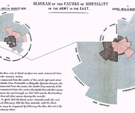
Editors note: This blog was originally published in October 2013, and has been completely revamped and updated for accuracy, relevancy, and comprehensiveness in September 2019 Prior to the 17th century, data visualization existed mainly in the realm of maps, displaying land markers, cities, roads, and resources.

article thumbnail

Why you should care about debugging machine learning models

O'Reilly on Data

Partial dependence, accumulated local effect (ALE), and individual conditional expectation (ICE) plots : this involves systematically visualizing the effects of changing one or more variables in your model. 8] , [12] Again, traditional model assessment measures don’t tell us much about whether a model is secure.

Insiders

Sign Up for our Newsletter

This site is protected by reCAPTCHA and the Google Privacy Policy and Terms of Service apply.

article thumbnail

Data Visualizations in Python and R

Sisense

The human brain processes visual data better than any other kind of data, which is good because about 90% of the information our brains process is visual. Visual processing and responses both occur more quickly compared to other stimuli. The brain processes data in visuals or images faster than data in text or rows of numbers.

article thumbnail

The AIgent: Using Google’s BERT Language Model to Connect Writers & Representation

Insight

In 2013, Robert Galbraith?—?an The most powerful approach for the first task is to use a ‘language model’ (LM), i.e. a statistical model of natural language. One way that we can get around this is to use the proportion of tags that fall into a given class as a measure of our degree of confidence in that class association.

article thumbnail

Towards optimal experimentation in online systems

The Unofficial Google Data Science Blog

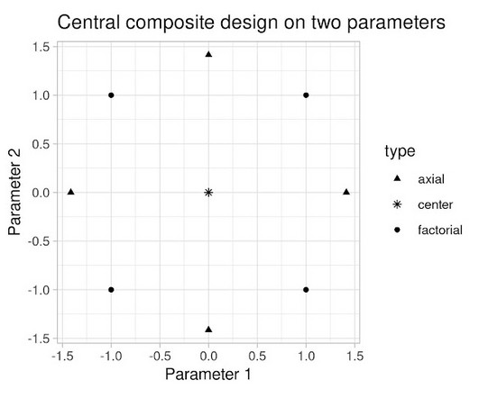
the weight given to Likes in our video recommendation algorithm) while $Y$ is a vector of outcome measures such as different metrics of user experience (e.g., Taking measurements at parameter settings further from control parameter settings leads to a lower variance estimate of the slope of the line relating the metric to the parameter.

article thumbnail

Periscope Data Expands to Israel, Empowering Data Teams with Powerful Tools

Sisense

The challenge is to do it right, and a crucial way to achieve it is with decisions based on data and analysis that drive measurable business results. He outlined how critical measurable results are to help VCs make major investment decisions — metrics such as revenue, net vs gross earnings, sales , costs and projections, and more.

article thumbnail

Manipulating Data with dplyr

Domino Data Lab

Special thanks to Addison-Wesley Professional for permission to excerpt the following “Manipulating data with dplyr” chapter from the book, Programming Skills for Data Science: Start Writing Code to Wrangle, Analyze, and Visualize Data with R. However, a grouped operation would allow you to compute the same summary measure (e.g.,